A new version of AfterGlow is ready. Version 1.6.5 has a couple of improvements:
1. If you have an input file which only has two columns, AfterGlow now automatically switches to a two-node mode. You don’t have to use the (-t) switch explicitly anymore in this case! (I know, it’s about time I added this)
2. Very minor change, but something that kept annoying me over time is the default edge length. It was set to 3 initially and now it’s reduced to 1.5, which makes fro a bit more compact graphs. You can still change this with the -e switch on the command line
3. The major change is about adding edge label though. Here is a quick example:
label.edge=$fields[2]
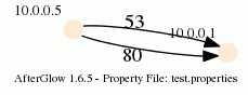
This assumes that the third column of your data contains the label for the data. In the example below, the port numbers:
10.0.0.5,10.0.0.1,53
10.0.0.5,10.0.0.1,80
When you run afterglow, use the -t switch to have it render only two nodes, but given the configuration above, we are using the third column as the edge label. The output will look like this:

As you can see, we have twice the same edge defined in the data with two different labels (port 53 and 80). If you want to have the graph show both edges, you add the following configuration in the configuration file:
label.duplicate=1
Which then results in the following graph:
Note that the duplicating of edges only works with GDF files (-k). The edge labels work in DOT and GDF files, not in GraphSON output.
What software is being used to generate graphs with duplicate labels?
Using such GDF files with Gephi gives a warning and it simply increases the weight of the first listed edge.
Comment by Johan — October 2, 2016 @ 12:10 pm
Afterglow is a nice to to quickly generate a graph, depending on the content one wants to visualize. But on the other hand, its pretty useless. It is not interactive, like most of the visualization tools. Instead of allowing security researchers / pentesters to play with the visualization to find the best solution, its edged in stone. Neo4j is a better approach. But the web frontend pretty quickly dies with to much data.
Its amazing that all the industry thinks about defense visualization and only the Darpa thinks about the offense since 2014. At least they have a solution (plan-x) now which should be state of the art. But compared to that, all our visualization attempts look like playing with child toys in a sandbox 🙁 Especially the offsec industry. They are stuck in 1980.
Comment by newgen — May 7, 2018 @ 7:03 am
No arguing with you on what you say about the non interactivity, etc. Mind you, the tool is over 10 years old at this point. The great thing is that it’s open source. You are welcome to change it in any way, shape, or form. I was part of a team that put a proposal in for PlanX. Is there anything public about it that I can look at? Super interested in how that came together.
Comment by Raffael Marty — May 19, 2018 @ 1:02 pm