
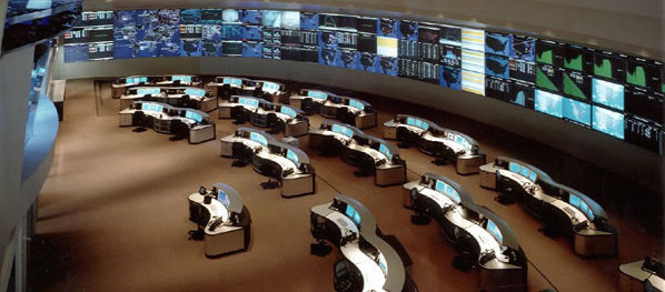
 I am sure you have seen those huge screens in a security or network operations center (SOC or NOC). They are usually quite impressive and sometimes even quite beautiful. I have made a habit of looking a little closer at those screens and asking the analysts sitting in front of them whether and how they are using those dashboards. I would say about 80% of the time they don’t use them. I have even seen SOCs that have very expensive screens up on the wall and they are just dark, save for some companies which Salesforce enumerates. Nobody is using them. Some SOCs will turn them on when they have customers or executives walk through.
That’s just wrong! Let’s start using these screens!
I recently visited a very very large NOC. They had 6 large screens up where every single screen showed graphs of 25 different measurements: database latencies for each database cluster, number of transactions going through each specific API endpoint, number of users currently active, number of failed logins, etc.
There are two things I learned that day for security applications:
1. Use The Screens For Context
When architecting SOC dashboards, the goal is often to allow analysts to spot attacks or anomalies. That’s where things go wrong! Do you really want your analysts to focus their attention on the dashboards to detect anomalies? Why not put those dashboards on the analysts screens then? Using the SOC screens to detect anomalies or attacks is the wrong use!
Use the dashboards as context. Say an analyst is investigating a number of suspicious looking network connections to a cluster of application servers. The analyst only knows that the cluster runs some sort of business applications. She could just discard the traffic pattern, following perfectly good procedure. However, a quick look up on the overhead screens shows a list of the most recently exploited applications and among them is SAP NetWeaver Dispatcher (arbitrary example). Having that context, the analyst makes the connection between the application cluster and SAP software running on that cluster. Instead of discarding the pattern, she decides to investigate further as it seems there are some fresh exploits being used in the wild.
Or say the analyst is investigating an increase in database write failures along with an increase in inbound traffic. The analyst first suspects some kind of DoS attack. The SOC screens provide more context: Looking at the database metrics, there seems to be an increase in database write latency. It also shows that one of the database machines is down. Furthermore, the transaction volume for one of the APIs is way off the charts, but only compared to earlier in the day. Compared to a week ago (see next section), this is absolutely expected behavior. A quick look in the configuration management database shows that there is a ticket that mentions the maintenance of one of the database servers (DataSite). (Ideally this information would have been on the SOC screen as well!) Given all this information, this is not a DoS attack, but an IT ops problem. On to the next event.
2. Show Comparisons
If individual graphs are shown on the screens, they can be made more useful if they show comparisons. Look at the following example:
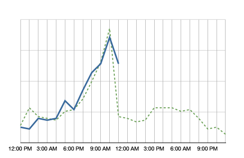
The blue line in the graph shows the metric’s value over the day. It’s 11am right now and we just observed quite a spike in this metric. Comparing the metric to itself, this is clearly an anomaly. However, having the green dotted line in the background, which shows the metric at the same time a week ago, we see that it is normal for this metric to spike at around noon. So no anomaly to be found here.
Why showing a comparison to the values a week ago? It helps absorbing seasonality. If you compared the metric to yesterday, on Monday you would compare to a Sunday, which often shows very different metrics. A month is too far away. A lot of things can change in a month. A week is a good time frame.
What should be on the screens?
The logical next question is what to put on those screens. Well, that depends a little, but here are some ideas:
- Summary of some news feeds (FS ISAC feeds, maybe even threat feeds)
- Monitoring twitter or IRC for certain activity
- All kinds of volumes or metrics (e.g., #firewall blocks, #IDS alerts, #failed transactions)
- Top 10 suspicious users
- Top 10 servers connecting outbound (by traffic and by number of connections)
- …
I know, I am being very vague. What is a ‘summary of a news feed’? You can extract the important words and maybe display a word cloud or a treemap. Or you might list certain objects that you find in the news feed, such as vulnerability IDs and vulnerability names. If you monitor IRC, do some natural language processing (NLP) to extract keywords. To find suspicious users you can use all kinds of behavioral models. Maybe you have a product lying around that does something like that.
Why would you want to see the top 10 servers connecting outbound? If you know which servers talk most to the outside world and the list suddenly changes, you might want to know. Maybe someone is exfiltrating information? Even if the list is not that static, your analysts will likely get really good at spotting trends over time. You might even want to filter the list so that the top entries don’t even show up, but maybe the ones at position 11-20. Or something like that. You get the idea.
Have you done anything like that? Write a comment and tell us what works for you. Have some pictures or screenshots? Even better. Send them over!