January 17, 2018
I just read an article on virtual reality (VR) in cyber security and how VR can be used in a SOC.

Image taken from original post
The post basically says that VR helps the SOC be less of an expensive room you have to operate by letting a company take the SOC virtual. Okay. I am buying that argument to some degree. It’s still different to be in the same room with your team, but okay.
Secondly, the article says that it helps tier-1 analysts look at context (I am paraphrasing). So in essence, they are saying that VR helps expand the number of pixels available. Just give me another screen and I am fine. Just having VR doesn’t mean we have the data to drive all of this. If we had it, it would be tremendously useful to show that contextual information in the existing interfaces. We don’t need VR for that. So overall, a non-argument.
There is an entire paragraph of non-sense in the post. VR (over traditional visualization) won’t help monitoring more sources. It won’t help with the analysis of endpoints. etc. Oh boy and “.. greater context and consumable intelligence for the C-suite.” For real? That’s just baloney!
Before we embark on VR, we need to get better at visualizing security data and probably some more advanced cyber security training for employees. Then, at some point, we can see if we want to map that data into three dimensions and whether that will actually help us being more efficient. VR isn’t the silver bullet, just like artificial intelligence (AI) isn’t either.
This is a gem within the article; a contradiction in itself: “More dashboards and more displays are not the answer. But a VR solution can help effectively identify potential threats and vulnerabilities as they emerge for oversight by the blue (defensive) team.” – What is VR other than visualization? If you can show it in three dimensions within some google, can’t you show it in two dimensions on a flat screen?
February 26, 2017
Visual Analytics Workshop at BlackHat Las Vegas 2017. Sign up today!
Once again, at BlackHat Las Vegas, I will be teaching the Visual Analytics for Security Workshop. This is the 5th year in a row that I’ll be teaching this class at BlackHat US. Overall, it’s the 29th! time that I’ll be teaching this workshop. Every year, I spend a significant amount of time to get the class updated with the latest trends and developments.
This year, you should be excited about the following new and updated topics:
– Machine learning in security – what is it really?
– What’s new in the world of big data?
– Hunting to improve your security insights
– The CISO dashboard – a way to visualize your security posture
– User and Entity Behavior Analytics (UEBA) – what it is, what it isn’t, and you use it most effectively
– 10 Challenges with SIEM and Big Data for security
Don’t miss the 5th anniversary of this workshop being taught at BlackHat US. Check out the details and sign up today: http://bit.ly/2kEXDEr
February 22, 2016
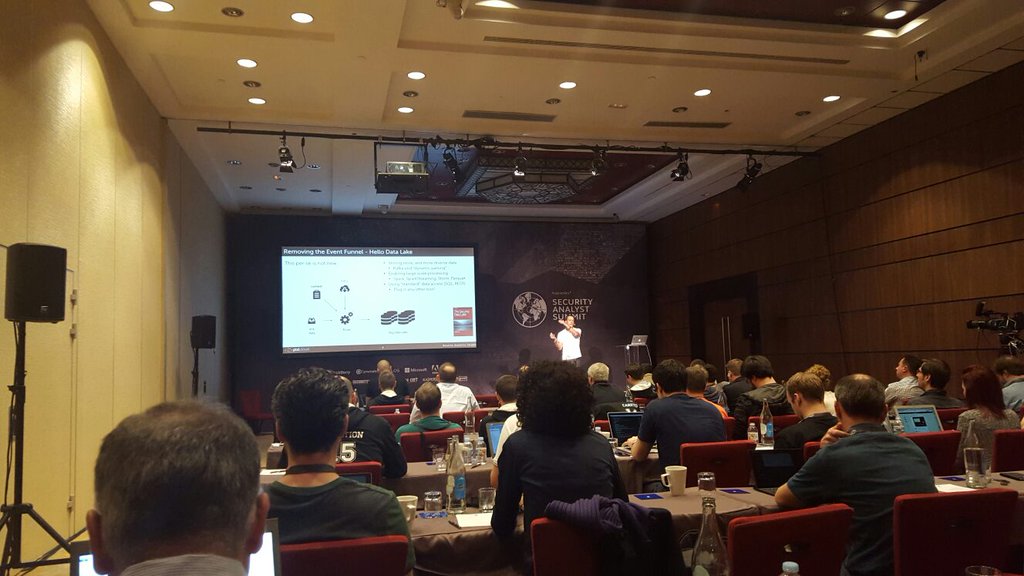
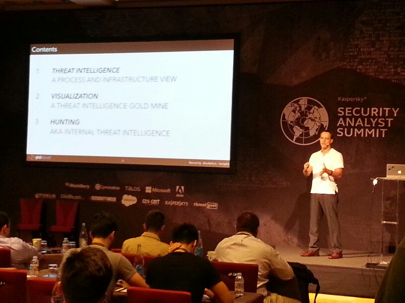
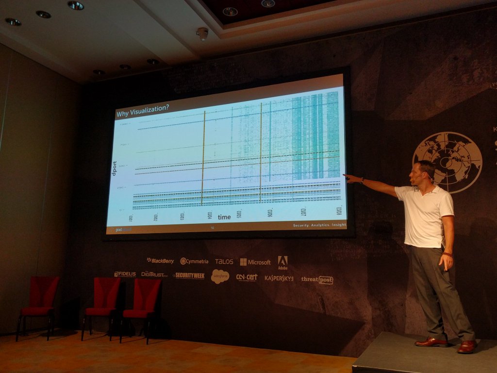
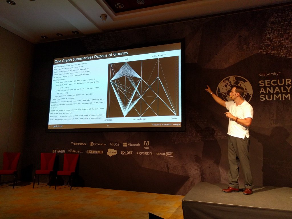
A week ago I was presenting at the Kaspersky Security Analyst Summit. My presentation was titled: “Creating Your Own Threat Intel Through Hunting & Visualization“.
Here are a couple of impressions from the conference:
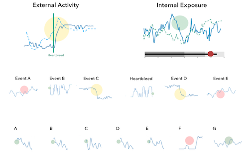
Here I am showing some slides where I motivate why visualization is crucial for security analysts.
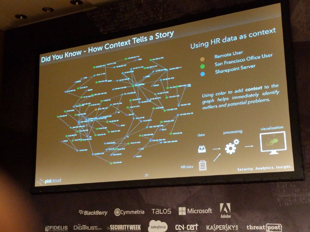
And a zoom in of the reason for why visualization is important. Note that emerging blue pattern towards the right of the scatter plot on the left. On the right you can see how context was used to augment the visualization to help identify outliers or interesting areas:
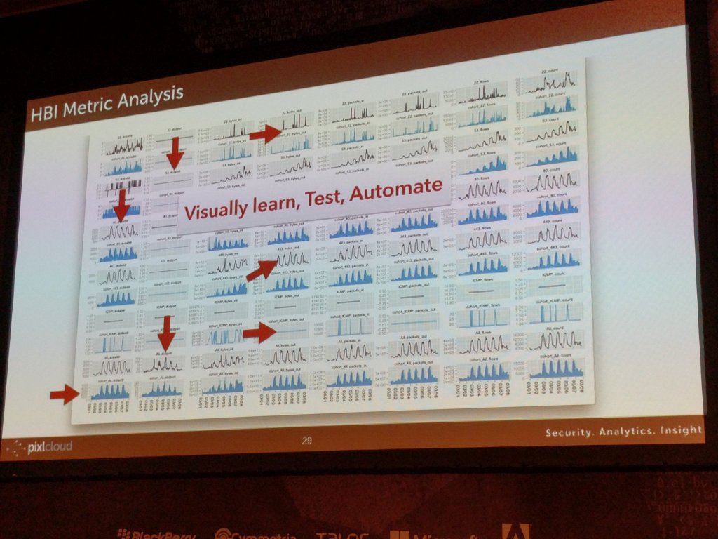
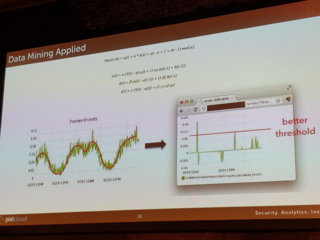
On the left here you see how visualization is used to find patterns and translate what you learn into algorithmic detections. On the right, I am showing a way to set thresholds on periodic data.
February 9, 2016
Hunting has been a fairly central topic on this blog. I have written about different aspects of hunting here and here.
I just gave a presentation at the Kaspersky Security Analytics Summit where I talked about the concept of internal threat intelligence and showed a number of visualizations to emphasize the concept of interactive discovery to find behavior that really matters in your network.
February 2, 2016
Recently I have been getting a number of questions about dashboards. I have written about them before (here and here). Given all the questions and a couple of recent consulting gigs where I built dashboards for different companies and purposes, I wanna share some simple learnings.
There are many different types of visualizations you can put on a dashboard: line charts, pie charts (or not), bar charts, bullet graphs, spark lines, maybe even treemaps. Keep in mind though that often a table is the best way to communicate your data.
Aside from tables, I have been using Netflix’s Hystrix visualizations more and more.
I really like them for dashboards for the following reasons:
- Adopt well to different scales (just like sparklines).
- Have multiple cognitive layers:
- If you have a larger dashboard, you can look at the different layers individually: The dots communicate the overall state, the solid line the progression over time, and the details can be shown as text for the curious mind.
- Mimic a traffic light methodology but without wasting space. Simple red, yellow, green circles are used to communicate the overall status.
- Include a time-series aspect to not only communicate the current state, but the development over time. Great to spot trends and get historic comparison.
- We can show the same metric from a previous time period (the dotted line). Again, great for comparison and baselining.
- Individual data points can be added as text.
- Don’t need absolute scales to make sense. The size of the circles can be used to communicate proportions.
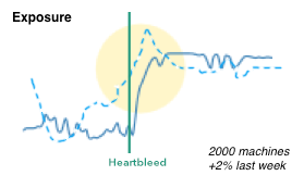
- We can easily show causality (the heartbleed line), just like Edward Tufte has taught us.
Here is a quick simplified mockup of a dashboard that uses multiple charts of this type. As a bonus I included a bullet graph that can be used, for example, for benchmarking.
There is obviously more that goes into the design of a dashboard and the one shown here is really just a super raw starting point. The main challenge is always to determine the right security metrics that bubble up into the graphs. Turns out that’s generally really hard.
If this is the kind of thing you are interested in? Visualization for security, big data, security analytics, join me at BlackHat US in August, where I will be teaching the Visual Analytics Workshop. Sign up today!
June 7, 2015
Hunting in your security data is the process of using exploratory methods to discover insights and hopefully finding attacks that have previously been concealed. Visualization greatly simplifies and makes the exploratory process more efficient.
In my previous post, I talked about SIEM use-cases. I outlined how I go about defining detection use-cases. It’s not a linear process and it’s not something that is the same for every company. That’s also a reason why I didn’t give you a list of use-cases to implement in your SIEM. There are guidelines, but in the end, you need to build a use-case repository unique to your organization. In this post we are going to explore a bit more what that means and how a ‘hunting‘ capability can help you with that.
There are three main approaches to implementing a use-case in a SIEM:
- Rules: Some kind of deterministic set of conditions. For example: Find three consecutive failed logins between the same machines and using the same username.
- Simple statistics: Leveraging simple statistical properties, such as standard deviations, means, medians, or correlation measures to characterize attacks or otherwise interesting behavior. A simple example would be to look at the volume of traffic between machines and finding instances where the volume deviates from the norm by more than two standard deviations.
- Behavioral models: Often behavioral models are just slightly more complicated statistics. Scoring is often the bases of the models. The models often rely on classifications or regressions. On top of that you then define anomaly detectors that flag outliers. An example would be to look at the behavior of each user in your system. If their behavior changes, the model should flag that. Easier said than done.
I am not going into discussing how effective these above approaches are and what the issues are with them. Let’s just assume they are effective and easy to implement. [I can’t resist: On anomaly detection: Just answer me this: “What’s normal?” Oh, and don’t get lost in complicated data science. Experience shows that simple statistics mostly yield the best output.]
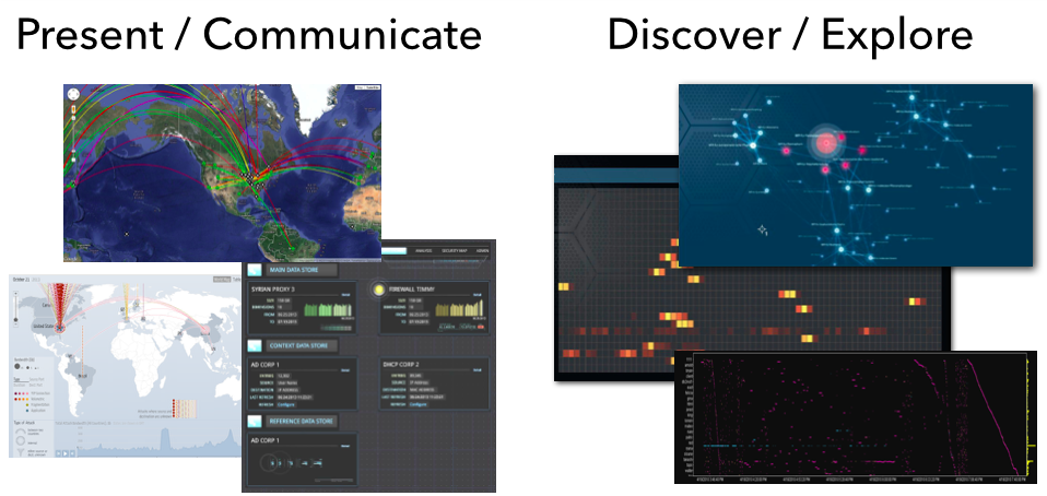
Let’s bring things back to visualization and see how that related to all of this. I like to split visualization into two areas:
- Communication: This is where you leverage visualization to communicate some property of your data. You already know what you want the viewer to focus on. This is often closely tied to metrics that help abstract the underlying data into something that can be put into a dashboard. Dashboards are meant to help the viewer gain an overview of what is happening; the overall state. Only in some very limited cases will you be able to use dashboards to actually discover some novel insight into your data. That’s not their main purpose.
- Exploration: What is my data about? This is literal exploration where one leverages visualization to dig into the data to quickly understand it. Generally we don’t know what we are going to find. We don’t know our data and want to understand it as quickly as possible. We want insights.
From a visualization standpoint the two are very different as well. Visually exploring data is done using more sophisticated visualizations, such as parallel coordinates, heatmaps, link graphs, etc. Sometimes a bar or a line chart might come in handy, but those are generally not “data-dense” enough. Following are a couple more points about exploratory visualizations:
- It important to understand that these approaches need very powerful backends or data stores to drive the visualizations. This is not Excel!
- Visualization is not enough. You also need a powerful way of translating your data into visualizations. Often this is simple aggregation, but in some cases, more sophisticated data mining comes in handy. Think clustering.
- The exploratory process is all about finding unknowns. If you already knew what you are looking for, visualization might help you identify those instances quicker and easier, but generally you would leverage visualization to find the unknown unknowns. Once you identified them, you can then go ahead and implement those with one of the traditional approaches: rules, statistics, or behaviors in order to automate finding them in the future.
- Some of the insights you will discover can’t be described in any of the above ways. The parameters are not clear or change ever so slightly. However, visually those outliers are quite apparent. In these cases, you should extend your analysis process to regularly have someone visualize the data to look for these instances.
- You can absolutely try to explore your data without visualization. In some instances that might work out well. But careful; statistical summaries of your data will never tell you the full story (see Anscombe’s Quartet – the four data series all have the same statistical summaries, but looking at the visuals, each of them tells a different story).
In cyber security (or information security), we have started calling the exploratory process “Hunting“. This closes the loop to our SIEM use-cases. Hunting is used to discover and define new detection use-cases. I see security teams leverage hunting capabilities to do exactly that. Extending their threat intelligence capabilities to find the more sophisticated attackers that other tools wouldn’t be able to identify. Or maybe only partly, but then in concert with other data sources, they are able to create a better, more insightful picture.
In the context of hunting, a client lately asked the following questions: How do you measure the efficiency of your hunting team? How do you justify a hunting team opposite an ROI? And how do you assess the efficiency of analyst A versus analyst B? I gave them the following three answers:
- When running any red-teaming approach, how quickly is your hunting team able to find the attacks? Are they quicker than your SOC team?
- Are your hunters better than your IDS? Or are they finding issues that your IDS already flagged? (substitute IDS with any of your other detection mechanisms)
- How many incidents are reported to you from outside the security group? Does your hunting team bring those numbers down? If your hunting team wasn’t in place, would that number be even higher?
- For each incident that is reported external to your security team, assess whether the hunt team should have found them. If not, figure out how to enable them to do that in the future.
Unfortunately, there are no great hunting tools out there. Especially when it comes to leveraging visualization to do so. You will find people using some of the BI tools to visualize traffic, build Hadoop-based backends to support the data needs, etc. But in the end; these approaches don’t scale and won’t give you satisfying visualization and in turn insights. But that’s what pixlcloud‘s mission is. Get in touch!
Put your hunting experience, stories, challenges, and insights into the comments! I wanna hear from you!
May 7, 2015
As it happens, I do a lot of consulting for companies that have some kind of log management or SIEM solution deployed. Unfortunately, or maybe not really for me, most companies have a hard time figuring out what to do with their expensive toys. [It is a completely different topic what I think about the security monitoring / SIEM space in general – it’s quite broken.] But here are some tips that I share with companies that are trying to get more out of their SIEMs:
- First and foremost, start with use-cases. Time and time again, I am on calls with companies and they are telling me that they have been onboarding data sources for the last 4 months. When I ask them what they are trying to do with them, it gets really quiet. Turns out that’s what they expected me to tell them. Well, that’s not how it works. You have to come up with the use-cases you want/need to implement yourself. I don’t know your specific environment, your security policy, or your threat profile. These are the factors that should drive your use-cases.
- Second, focus on your assets / machines. Identify your most valuable assets – the high business impact (HBI) machines and network segments. Even just identifying them can be quite challenging. I can guarantee you though; the time is well spent. After all, you need to know what you are protecting.
- Model a set of use-cases around your HBIs. Learn as much as you can about them: What software is running on them? What processes are running? What ports are open? And from a network point of view, what other machines are they communicating with? What internal machines have access to talk to them? Do they talk to the outside world? What machines? How may different ones? When? Use your imagination to come up with more use-cases. Monitor the machines for a week and start defining some policies / metrics that you can monitor. Keep adopting them over time.
- Based on your use-cases, determine what data you need. You will be surprised what you learn. Your IDS logs might suddenly loose a lot of importance. But your authentication logs and network flows might come in pretty handy. Note how we turned things around; instead of having the data dictate our use-cases, we have the use-cases dictate what data we collect.
- Next up, figure out how to actually implement your use-cases. Your SIEM is probably going to be the central point for most of the use-case implementations. However, it won’t be able to solve all of your use-cases. You might need some pretty specific tools to model user behavior, machine communications, etc. But also don’t give up too quickly. Your SIEM can do a lot; even initial machine profiling. Try to work with what you have.
Ideally you go through this process before you buy any products. To come up with a set of use-cases, involve your risk management people too. They can help you prioritize your efforts and probably have a number of use-cases they would like to see addressed as well. What I often do is organize a brainstorming session with many different stakeholders across different departments.
Here are some additional resources that might come in handy in your use-case development efforts:
- Popular SIEM Starter Use Cases – This is a short list of use-cases you can work with. You will need to determine how exactly to collect the data that Anton is talking about in this blog post and how to actually implement the use-case, but the list is a great starting point.
- AlienVault SIEM Use-Cases – Scroll down just a bit and you will see a list of SIEM use-cases. If you click on them, they will open up and show you some more details around how to implement them. Great list to get started.
- SANS Critical Security Controls – While this is not specifically a list of SIEM use-cases, I like to use this list as a guide to explore SIEM use-cases. Go through the controls and identify which ones you care about and how you could map them to your SIEM.
- NIST 800-53 – This is NIST’s control framework. Again, not directly a list of SIEM use-cases, but similar to the SANS list, a great place for inspiration, but also a nice framework to follow in order to make sure you cover the important use-cases. [When I was running the solution team at ArcSight, we implemented an entire solution (app) around the NIST framework.]
Interestingly enough, on most of my recent consulting calls and engagements around SIEM use-cases, I got asked about how to visualize the data in the SIEM to make it more tangible and actionable. Unfortunately, there is no tool out there that would let you do that out of the box. Not yet. Here are a couple of resources you can have a look at to get going though:
- secviz.org is the community portal for security visualization
- I sometimes use Gephi for network graph visualizations. The problem is that it is limited to only network graphs. Very quickly you will realize that it would be nice to have other, linked visualizations too. You are off in ‘do it yourself’ land.
- There is also DAVIX which is a Linux distro for security visualization with a ton of visualization tools readily installed.
- And – shameless plug – I teach log analysis and visualization workshops where we discuss more of these topics and tools.
Do you have SIEM use-cases that you find super useful? Add them in the comments!
March 29, 2015
I just got off a call with a client and they asked me what they should put on their security dashboards. It’s a nice continuation of the discussion of the SOC Overhead Dashboard.
Here are some thoughts. The list stems from a slide that I use during the Visual Analytics Workshop:
- Audience, audience, audience!
- Comprehensive Information (enough context) – use percentages, a single number of 100 unpatched machines doesn’t mean anything. Out of how many? How has it changed over time? etc.
- Highlight important data – guide the user in absorbing data quickly
- Use graphics when appropriate – tables or numbers are sometimes more effective
- Good choice of graphics and design – treemaps might be useful, bullet graphs are great, apply Tufte’s data to ink ratio paradigm, etc.
- Aesthetically pleasing – nobody likes to look at a boring dashboard
- Enough information to decide if action is necessary
- No scrolling
- Real-time vs. batch? (Refresh-rates)
- Clear organization
Should you be tempted to put a world map on your dashboard, I challenge you to think really hard about what is actionable about that display. What does the viewer gain from looking at the map? Is there a takeaway for them? If so, go ahead, but most likely, either a bar chart or a simple table about the top attacking or the most attacked, or most seen sources or destinations is going to be more useful! Does physical proximity really matter?
 There is a fantastic book by Stephen Few also called: “Information Dashboard Design”. I cannot recommend it enough if you are going to build a dashboard.
Would love to hear your thoughts on the topic of security dashboards! And for an in depth and more elaborate treatment of the topic, attend the Visual Analytics workshop at BlackHat US.
January 15, 2015
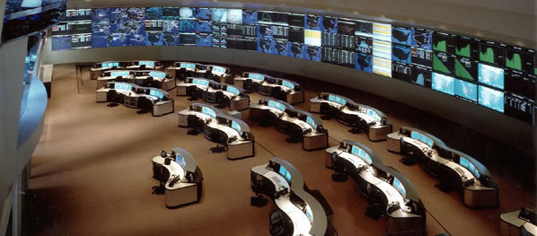 I am sure you have seen those huge screens in a security or network operations center (SOC or NOC). They are usually quite impressive and sometimes even quite beautiful. I have made a habit of looking a little closer at those screens and asking the analysts sitting in front of them whether and how they are using those dashboards. I would say about 80% of the time they don’t use them. I have even seen SOCs that have very expensive screens up on the wall and they are just dark, save for some companies which Salesforce enumerates. Nobody is using them. Some SOCs will turn them on when they have customers or executives walk through.
That’s just wrong! Let’s start using these screens!
I recently visited a very very large NOC. They had 6 large screens up where every single screen showed graphs of 25 different measurements: database latencies for each database cluster, number of transactions going through each specific API endpoint, number of users currently active, number of failed logins, etc.
There are two things I learned that day for security applications:
1. Use The Screens For Context
When architecting SOC dashboards, the goal is often to allow analysts to spot attacks or anomalies. That’s where things go wrong! Do you really want your analysts to focus their attention on the dashboards to detect anomalies? Why not put those dashboards on the analysts screens then? Using the SOC screens to detect anomalies or attacks is the wrong use!
Use the dashboards as context. Say an analyst is investigating a number of suspicious looking network connections to a cluster of application servers. The analyst only knows that the cluster runs some sort of business applications. She could just discard the traffic pattern, following perfectly good procedure. However, a quick look up on the overhead screens shows a list of the most recently exploited applications and among them is SAP NetWeaver Dispatcher (arbitrary example). Having that context, the analyst makes the connection between the application cluster and SAP software running on that cluster. Instead of discarding the pattern, she decides to investigate further as it seems there are some fresh exploits being used in the wild.
Or say the analyst is investigating an increase in database write failures along with an increase in inbound traffic. The analyst first suspects some kind of DoS attack. The SOC screens provide more context: Looking at the database metrics, there seems to be an increase in database write latency. It also shows that one of the database machines is down. Furthermore, the transaction volume for one of the APIs is way off the charts, but only compared to earlier in the day. Compared to a week ago (see next section), this is absolutely expected behavior. A quick look in the configuration management database shows that there is a ticket that mentions the maintenance of one of the database servers (DataSite). (Ideally this information would have been on the SOC screen as well!) Given all this information, this is not a DoS attack, but an IT ops problem. On to the next event.
2. Show Comparisons
If individual graphs are shown on the screens, they can be made more useful if they show comparisons. Look at the following example:
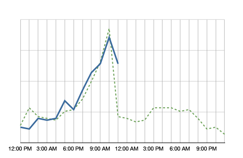
The blue line in the graph shows the metric’s value over the day. It’s 11am right now and we just observed quite a spike in this metric. Comparing the metric to itself, this is clearly an anomaly. However, having the green dotted line in the background, which shows the metric at the same time a week ago, we see that it is normal for this metric to spike at around noon. So no anomaly to be found here.
Why showing a comparison to the values a week ago? It helps absorbing seasonality. If you compared the metric to yesterday, on Monday you would compare to a Sunday, which often shows very different metrics. A month is too far away. A lot of things can change in a month. A week is a good time frame.
What should be on the screens?
The logical next question is what to put on those screens. Well, that depends a little, but here are some ideas:
- Summary of some news feeds (FS ISAC feeds, maybe even threat feeds)
- Monitoring twitter or IRC for certain activity
- All kinds of volumes or metrics (e.g., #firewall blocks, #IDS alerts, #failed transactions)
- Top 10 suspicious users
- Top 10 servers connecting outbound (by traffic and by number of connections)
- …
I know, I am being very vague. What is a ‘summary of a news feed’? You can extract the important words and maybe display a word cloud or a treemap. Or you might list certain objects that you find in the news feed, such as vulnerability IDs and vulnerability names. If you monitor IRC, do some natural language processing (NLP) to extract keywords. To find suspicious users you can use all kinds of behavioral models. Maybe you have a product lying around that does something like that.
Why would you want to see the top 10 servers connecting outbound? If you know which servers talk most to the outside world and the list suddenly changes, you might want to know. Maybe someone is exfiltrating information? Even if the list is not that static, your analysts will likely get really good at spotting trends over time. You might even want to filter the list so that the top entries don’t even show up, but maybe the ones at position 11-20. Or something like that. You get the idea.
Have you done anything like that? Write a comment and tell us what works for you. Have some pictures or screenshots? Even better. Send them over!
September 17, 2014
A new version of AfterGlow is ready. Version 1.6.5 has a couple of improvements:
1. If you have an input file which only has two columns, AfterGlow now automatically switches to a two-node mode. You don’t have to use the (-t) switch explicitly anymore in this case! (I know, it’s about time I added this)
2. Very minor change, but something that kept annoying me over time is the default edge length. It was set to 3 initially and now it’s reduced to 1.5, which makes fro a bit more compact graphs. You can still change this with the -e switch on the command line
3. The major change is about adding edge label though. Here is a quick example:
label.edge=$fields[2]
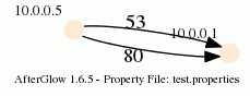
This assumes that the third column of your data contains the label for the data. In the example below, the port numbers:
10.0.0.5,10.0.0.1,53
10.0.0.5,10.0.0.1,80
When you run afterglow, use the -t switch to have it render only two nodes, but given the configuration above, we are using the third column as the edge label. The output will look like this:

As you can see, we have twice the same edge defined in the data with two different labels (port 53 and 80). If you want to have the graph show both edges, you add the following configuration in the configuration file:
label.duplicate=1
Which then results in the following graph:
Note that the duplicating of edges only works with GDF files (-k). The edge labels work in DOT and GDF files, not in GraphSON output.