I just got off a call with a client and they asked me what they should put on their security dashboards. It’s a nice continuation of the discussion of the SOC Overhead Dashboard.
Here are some thoughts. The list stems from a slide that I use during the Visual Analytics Workshop:
- Audience, audience, audience!
- Comprehensive Information (enough context) – use percentages, a single number of 100 unpatched machines doesn’t mean anything. Out of how many? How has it changed over time? etc.
- Highlight important data – guide the user in absorbing data quickly
- Use graphics when appropriate – tables or numbers are sometimes more effective
- Good choice of graphics and design – treemaps might be useful, bullet graphs are great, apply Tufte’s data to ink ratio paradigm, etc.
- Aesthetically pleasing – nobody likes to look at a boring dashboard
- Enough information to decide if action is necessary
- No scrolling
- Real-time vs. batch? (Refresh-rates)
- Clear organization
Should you be tempted to put a world map on your dashboard, I challenge you to think really hard about what is actionable about that display. What does the viewer gain from looking at the map? Is there a takeaway for them? If so, go ahead, but most likely, either a bar chart or a simple table about the top attacking or the most attacked, or most seen sources or destinations is going to be more useful! Does physical proximity really matter?
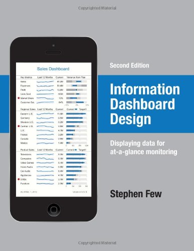
 There is a fantastic book by Stephen Few also called: “Information Dashboard Design”. I cannot recommend it enough if you are going to build a dashboard.
Would love to hear your thoughts on the topic of security dashboards! And for an in depth and more elaborate treatment of the topic, attend the Visual Analytics workshop at BlackHat US.
