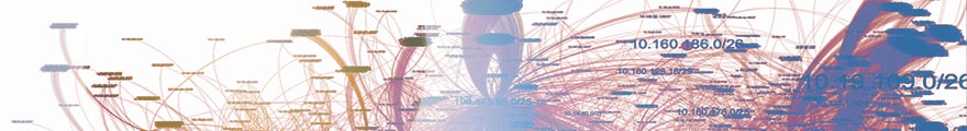
 There are cases where you need fairly sophisticated logic to visualize data. Network graphs are a great way to help a viewer understand relationships in data. In my last blog post, I explained how to visualize network traffic. Today I am showing you how to extend your visualization with some more complicated configurations.
This blog post was inspired by an AfterGlow user who emailed me last week asking how he could keep a list of port numbers to drive the color in his graph. Here is the code snippet that I suggested he use:
variable=@ports=qw(22 80 53 110);

color="green" if (grep(/^\Q$fields[0]\E$/,@ports))
Put this in a configuration file and invoke AfterGlow with it:
perl afterglow.pl -c file.config | ...
What this does is color all nodes green if they are part of the list of ports (22, 80, 53, 110). I am using $fields[0] to reference the first column of data. You could also use the function fields() to reference any column in the data.
Another way to define the variable is by looking it up in a file. Here is an example:
variable=open(TOR,"tor.csv"); @tor=
color="red" if (grep(/^\Q$fields[1]\E$/,@tor))
This time you put the list of items in a file and read it into an array. Remember, it’s just Perl code that you execute after the variable= statement. Anything goes!
I am curious what you will come up with. Post your experiments and questions on secviz.org!
Read more about how to use AfterGlow in security visualization.
very interesting – but why not lift the metadata directly from the pcap files ? Also you are losing information content by not using the links to identify traffic classes… but this is really interesting, all along the lines of something i was working on recently also in perl 🙂
Comment by Dork Lord — April 13, 2012 @ 10:24 pm
Not sure I get your comment at all? The meta data from the pcap file? What meta data? The data in the files is used to add color to the graph. It’s not to color ALL nodes the same way, but some specific ones. Same for your other comment. what information am I losing?
AfterGlow is not a network traffic visualization tool. It’s a tool to visualize any relationships that you have captured in CSV format. It helps you visualize those relationships by adding clustering, coloring, filters, etc.
Comment by Raffael Marty — April 14, 2012 @ 1:14 pm
[…] http://raffy.ch/blog/2012/03/24/advanced-network-graph-visualization-with-afterglow/ […]
Pingback by Security Intelligence and Big Data | raffy.ch – blog » Advanced Network Graph Visualization with AfterGlow « Landis Vinchattle — May 14, 2012 @ 6:36 pm
Looking like a nice thing to play with, AfterGlow, to visualize data. Thanks for the post, will check it out.
Comment by Thomas Vanhoutte — June 8, 2012 @ 8:09 am
Can you recommend any tools that support interactive visualization ?
Thanks,
Evgeni
Comment by Evgeni — December 18, 2012 @ 12:27 am
Evgeni,
That’s a good question. There are, unfortunately, not that many interactive tools out there. Gephi (gephi.org) is pretty good for network graphs. You can also code your own with D3js.
Comment by Raffael Marty — December 18, 2012 @ 8:46 am
Hi Raffael,
Back in 2001 I wrote scanmap3d as an interactive visualization front end to a database of snort alerts. I am in the process of dusting off the code to update it for the latest msyql,java3d,jre changes. I want to make some improvements to the context based self-structuring that occurs in the visualization, so will be interested in looking at some of your papers on-line. Keeping the balance between visual complexity and the capacity of the viewer to process the information was become a big challenge.
Comment by zhennian — August 26, 2013 @ 9:01 pm
hi i have sucessfully generated graphs using it but i am not getting lablel on them?? can u help me out. Tell me which option i am skipping
psad –CSV –CSV-fields “src dst dp sp” –CSV-max 1000 -m /var/log/firewall.log | perl /opt/afterglow/src/perl/graph/afterglow.pl -c /opt/afterglow/src/perl/parsers/color.properties | neato -Tjpg -o iptable_graph03.jpg
Comment by sanjay — October 13, 2013 @ 2:21 pm
I am not sure. You are using the sample properties file that is provided. Try without a properties file. Then look at the DOT file that afterglow generates (before you pipe it to neato). Do the nodes show labels? Or xlabels maybe? If there are xlabels, set xlabels=0 in the properties. Does that work?
Comment by Raffael Marty — October 14, 2013 @ 9:32 am
no its nor working….it just provides black and white graph…..nthg else
Comment by sanjay — October 16, 2013 @ 5:34 am
Great tip, thanks a lot!
Comment by Rob Lars — November 14, 2017 @ 9:36 am