Okay, this post is going to be a bit strange. It’s a quick brain dump from a technical perspective, what it would take to build the perfect security monitoring environment.
We’d need data and contextual information to start with:
Any data:
- infrastructure / network logs (flows, dns, dhcp, proxy, routing, IPS, DLP, …)
- host logs (file access, process launch, socket activity, etc.)
- HIPS, anti virus, file integrity
- application logs (Web, SAP, HR, …)
- metrics
- configuration changes (host, network equipment, physical access, applications)
- indicators of compromise (threat feeds)
- physical access logs
- cloud instrumentation data
- change tickets
- incident information
Any context:
- asset information and classification
- identity context (roles, etc.)
- information classification and location (tracking movement?)
- HR / presonell information
- vulnerability scans
- configuration information for each machine, network device, and application
With all this information, what are the different jobs / tasks / themes that need to be covered from a data consumption perspective?
- situational awareness / dashboards
- alert triage
- forensic investigations
- metric generation from raw logs / mapping to some kind of risk
- incident management / sharing information / collaboration
- hunting
- running models on the data (data science)
-
- anomaly detection
- behavioral analysis
- scoring
- reports (PDF, HTML)
- real-time matching against high volume threat feeds
- remediating security problems
- continuous compliance
- controls verification / audit
What would the right data store look like? What would its capabilities be?
- storing any kind of data
- kind of schema less but with schema on demand
- storing event data (time-stamped data, logs)
- storing metrics
- fast random access of small amounts of data, aka search
- analytical questions
- looking for ‘patterns’ in the data – maybe something like a computer science grammar that defines patterns
- building dynamic context from the data (e.g., who was on what machine at what time)
- anonymization
Looks like there would probably be different data stores: We’d need an index, probably a graph store for complex queries, a columnar store for the analytical questions, pre-aggregated data to answer some of the common queries, and the raw logs as well. Oh boy 😉
I am sure I am missing a bunch of things here. Care to comment?
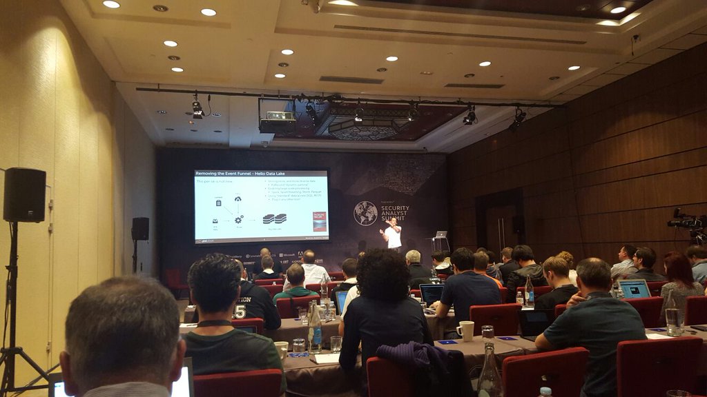
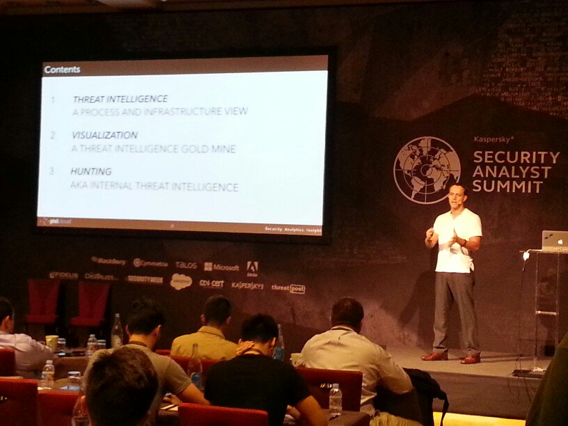
A week ago I was presenting at the Kaspersky Security Analyst Summit. My presentation was titled: “Creating Your Own Threat Intel Through Hunting & Visualization“.
Here are a couple of impressions from the conference:
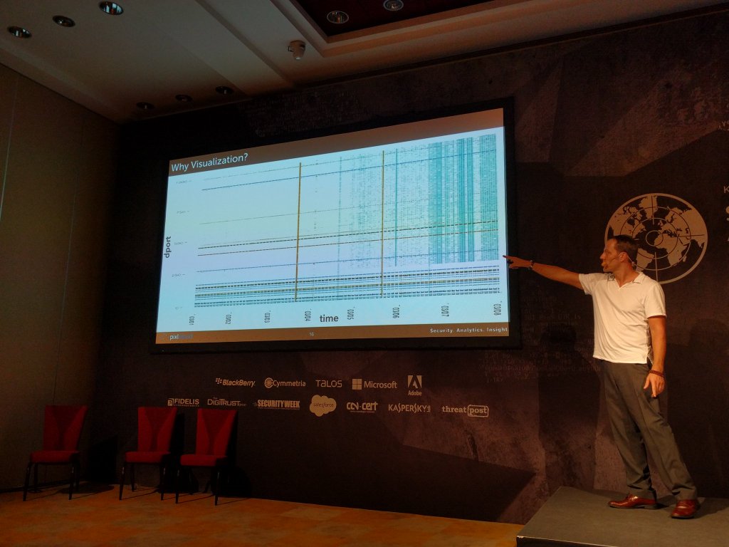
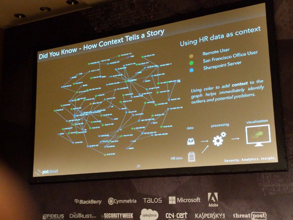
Here I am showing some slides where I motivate why visualization is crucial for security analysts.
And a zoom in of the reason for why visualization is important. Note that emerging blue pattern towards the right of the scatter plot on the left. On the right you can see how context was used to augment the visualization to help identify outliers or interesting areas:
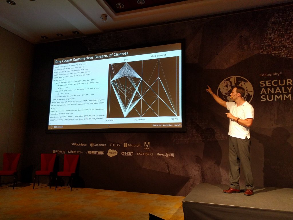
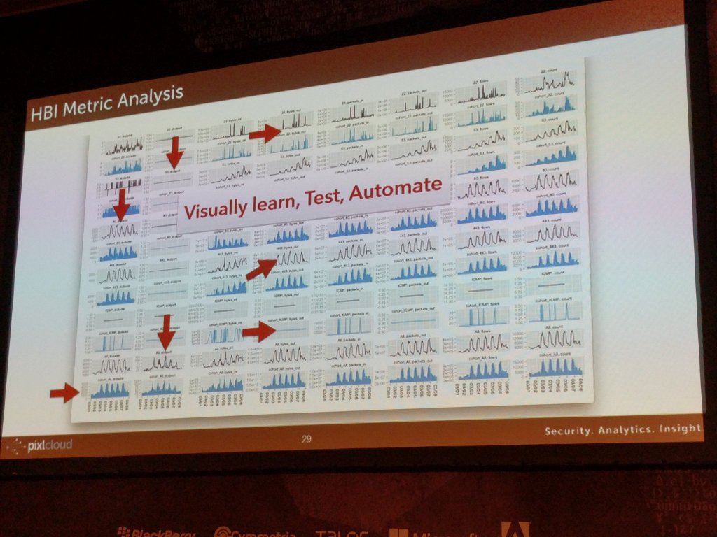
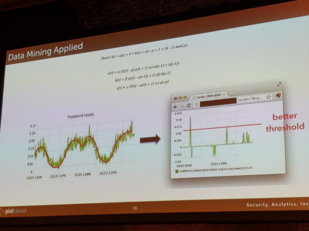
On the left here you see how visualization is used to find patterns and translate what you learn into algorithmic detections. On the right, I am showing a way to set thresholds on periodic data.
Hunting has been a fairly central topic on this blog. I have written about different aspects of hunting here and here.
I just gave a presentation at the Kaspersky Security Analytics Summit where I talked about the concept of internal threat intelligence and showed a number of visualizations to emphasize the concept of interactive discovery to find behavior that really matters in your network.
Recently I have been getting a number of questions about dashboards. I have written about them before (here and here). Given all the questions and a couple of recent consulting gigs where I built dashboards for different companies and purposes, I wanna share some simple learnings.
There are many different types of visualizations you can put on a dashboard: line charts, pie charts (or not), bar charts, bullet graphs, spark lines, maybe even treemaps. Keep in mind though that often a table is the best way to communicate your data.
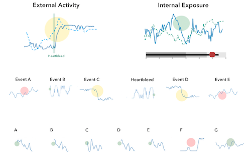
Aside from tables, I have been using Netflix’s Hystrix visualizations more and more.

I really like them for dashboards for the following reasons:
- Adopt well to different scales (just like sparklines).
- Have multiple cognitive layers:
- If you have a larger dashboard, you can look at the different layers individually: The dots communicate the overall state, the solid line the progression over time, and the details can be shown as text for the curious mind.
- Mimic a traffic light methodology but without wasting space. Simple red, yellow, green circles are used to communicate the overall status.
- Include a time-series aspect to not only communicate the current state, but the development over time. Great to spot trends and get historic comparison.
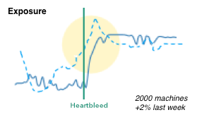
- We can show the same metric from a previous time period (the dotted line). Again, great for comparison and baselining.
- Individual data points can be added as text.
- Don’t need absolute scales to make sense. The size of the circles can be used to communicate proportions.
- We can easily show causality (the heartbleed line), just like Edward Tufte has taught us.
Here is a quick simplified mockup of a dashboard that uses multiple charts of this type. As a bonus I included a bullet graph that can be used, for example, for benchmarking.

There is obviously more that goes into the design of a dashboard and the one shown here is really just a super raw starting point. The main challenge is always to determine the right security metrics that bubble up into the graphs. Turns out that’s generally really hard.
If this is the kind of thing you are interested in? Visualization for security, big data, security analytics, join me at BlackHat US in August, where I will be teaching the Visual Analytics Workshop. Sign up today!


