Recently I have been getting a number of questions about dashboards. I have written about them before (here and here). Given all the questions and a couple of recent consulting gigs where I built dashboards for different companies and purposes, I wanna share some simple learnings.
There are many different types of visualizations you can put on a dashboard: line charts, pie charts (or not), bar charts, bullet graphs, spark lines, maybe even treemaps. Keep in mind though that often a table is the best way to communicate your data.
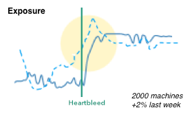
Aside from tables, I have been using Netflix’s Hystrix visualizations more and more.

I really like them for dashboards for the following reasons:
- Adopt well to different scales (just like sparklines).
- Have multiple cognitive layers:
- If you have a larger dashboard, you can look at the different layers individually: The dots communicate the overall state, the solid line the progression over time, and the details can be shown as text for the curious mind.
- Mimic a traffic light methodology but without wasting space. Simple red, yellow, green circles are used to communicate the overall status.
- Include a time-series aspect to not only communicate the current state, but the development over time. Great to spot trends and get historic comparison.
- We can show the same metric from a previous time period (the dotted line). Again, great for comparison and baselining.
- Individual data points can be added as text.
- Don’t need absolute scales to make sense. The size of the circles can be used to communicate proportions.
- We can easily show causality (the heartbleed line), just like Edward Tufte has taught us.
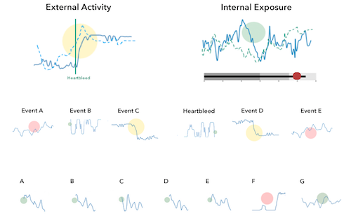
Here is a quick simplified mockup of a dashboard that uses multiple charts of this type. As a bonus I included a bullet graph that can be used, for example, for benchmarking.

There is obviously more that goes into the design of a dashboard and the one shown here is really just a super raw starting point. The main challenge is always to determine the right security metrics that bubble up into the graphs. Turns out that’s generally really hard.
If this is the kind of thing you are interested in? Visualization for security, big data, security analytics, join me at BlackHat US in August, where I will be teaching the Visual Analytics Workshop. Sign up today!
