Hunting in your security data is the process of using exploratory methods to discover insights and hopefully finding attacks that have previously been concealed. Visualization greatly simplifies and makes the exploratory process more efficient.
In my previous post, I talked about SIEM use-cases. I outlined how I go about defining detection use-cases. It’s not a linear process and it’s not something that is the same for every company. That’s also a reason why I didn’t give you a list of use-cases to implement in your SIEM. There are guidelines, but in the end, you need to build a use-case repository unique to your organization. In this post we are going to explore a bit more what that means and how a ‘hunting‘ capability can help you with that.
There are three main approaches to implementing a use-case in a SIEM:
- Rules: Some kind of deterministic set of conditions. For example: Find three consecutive failed logins between the same machines and using the same username.
- Simple statistics: Leveraging simple statistical properties, such as standard deviations, means, medians, or correlation measures to characterize attacks or otherwise interesting behavior. A simple example would be to look at the volume of traffic between machines and finding instances where the volume deviates from the norm by more than two standard deviations.
- Behavioral models: Often behavioral models are just slightly more complicated statistics. Scoring is often the bases of the models. The models often rely on classifications or regressions. On top of that you then define anomaly detectors that flag outliers. An example would be to look at the behavior of each user in your system. If their behavior changes, the model should flag that. Easier said than done.
I am not going into discussing how effective these above approaches are and what the issues are with them. Let’s just assume they are effective and easy to implement. [I can’t resist: On anomaly detection: Just answer me this: “What’s normal?” Oh, and don’t get lost in complicated data science. Experience shows that simple statistics mostly yield the best output.]
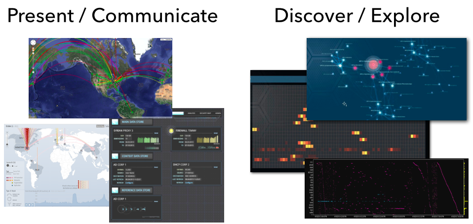
Let’s bring things back to visualization and see how that related to all of this. I like to split visualization into two areas:
- Communication: This is where you leverage visualization to communicate some property of your data. You already know what you want the viewer to focus on. This is often closely tied to metrics that help abstract the underlying data into something that can be put into a dashboard. Dashboards are meant to help the viewer gain an overview of what is happening; the overall state. Only in some very limited cases will you be able to use dashboards to actually discover some novel insight into your data. That’s not their main purpose.
- Exploration: What is my data about? This is literal exploration where one leverages visualization to dig into the data to quickly understand it. Generally we don’t know what we are going to find. We don’t know our data and want to understand it as quickly as possible. We want insights.
From a visualization standpoint the two are very different as well. Visually exploring data is done using more sophisticated visualizations, such as parallel coordinates, heatmaps, link graphs, etc. Sometimes a bar or a line chart might come in handy, but those are generally not “data-dense” enough. Following are a couple more points about exploratory visualizations:
- It important to understand that these approaches need very powerful backends or data stores to drive the visualizations. This is not Excel!
- Visualization is not enough. You also need a powerful way of translating your data into visualizations. Often this is simple aggregation, but in some cases, more sophisticated data mining comes in handy. Think clustering.
- The exploratory process is all about finding unknowns. If you already knew what you are looking for, visualization might help you identify those instances quicker and easier, but generally you would leverage visualization to find the unknown unknowns. Once you identified them, you can then go ahead and implement those with one of the traditional approaches: rules, statistics, or behaviors in order to automate finding them in the future.
- Some of the insights you will discover can’t be described in any of the above ways. The parameters are not clear or change ever so slightly. However, visually those outliers are quite apparent. In these cases, you should extend your analysis process to regularly have someone visualize the data to look for these instances.
- You can absolutely try to explore your data without visualization. In some instances that might work out well. But careful; statistical summaries of your data will never tell you the full story (see Anscombe’s Quartet – the four data series all have the same statistical summaries, but looking at the visuals, each of them tells a different story).
In cyber security (or information security), we have started calling the exploratory process “Hunting“. This closes the loop to our SIEM use-cases. Hunting is used to discover and define new detection use-cases. I see security teams leverage hunting capabilities to do exactly that. Extending their threat intelligence capabilities to find the more sophisticated attackers that other tools wouldn’t be able to identify. Or maybe only partly, but then in concert with other data sources, they are able to create a better, more insightful picture.
In the context of hunting, a client lately asked the following questions: How do you measure the efficiency of your hunting team? How do you justify a hunting team opposite an ROI? And how do you assess the efficiency of analyst A versus analyst B? I gave them the following three answers:
- When running any red-teaming approach, how quickly is your hunting team able to find the attacks? Are they quicker than your SOC team?
- Are your hunters better than your IDS? Or are they finding issues that your IDS already flagged? (substitute IDS with any of your other detection mechanisms)
- How many incidents are reported to you from outside the security group? Does your hunting team bring those numbers down? If your hunting team wasn’t in place, would that number be even higher?
- For each incident that is reported external to your security team, assess whether the hunt team should have found them. If not, figure out how to enable them to do that in the future.
Unfortunately, there are no great hunting tools out there. Especially when it comes to leveraging visualization to do so. You will find people using some of the BI tools to visualize traffic, build Hadoop-based backends to support the data needs, etc. But in the end; these approaches don’t scale and won’t give you satisfying visualization and in turn insights. But that’s what pixlcloud‘s mission is. Get in touch!
Put your hunting experience, stories, challenges, and insights into the comments! I wanna hear from you!
As I outlined in my previous blog post on How to clean up network traffic logs, I have been working with the VAST 2013 traffic logs. Today I am going to show you can load the traffic logs into Impala (with a parquet table) for very quick querying.
First off, Impala is a real-time search engine for Hadoop (i.e., Hive/HDFS). So, scalable, distributed, etc. In the following I am assuming that you have Impala installed already. If not, I recommend you use the Cloudera Manager to do so. It’s pretty straight forward.
First we have to load the data into Impala, which is a two step process. We are using external tables, meaning that the data will live in files on HDFS. What we have to do is getting the data into HDFS first and then loading it into Impala:
$ sudo su - hdfs
$ hdfs dfs -put /tmp/nf-chunk*.csv /user/hdfs/data
We first become the hdfs user, then copy all of the netflow files from the MiniChallenge into HDFS at /user/hdfs/data. Next up we connect to impala and create the database schema:
$ impala-shell
create external table if not exists logs (
	TimeSeconds double,
	parsedDate timestamp,
	dateTimeStr string,
	ipLayerProtocol int,
	ipLayerProtocolCode string,
	firstSeenSrcIp string,
	firstSeenDestIp string,
	firstSeenSrcPort int,
	firstSeenDestPor int,
	moreFragment int,
	contFragment int,
	durationSecond int,
	firstSeenSrcPayloadByte bigint,
	firstSeenDestPayloadByte bigint,
	firstSeenSrcTotalByte bigint,
	firstSeenDestTotalByte bigint,
	firstSeenSrcPacketCoun int,
	firstSeenDestPacketCoun int,
	recordForceOut int)
row format delimited fields terminated by ',' lines terminated by '\n'
location '/user/hdfs/data/';
Now we have a table called ‘logs’ that contains all of our data. We told Impala that the data is comma separated and told it where the data files are. That’s already it. What I did on my installation is leveraging the columnar data format of Impala to speed queries up. A lot of analytic queries don’t really suit the row-oriented manner of databases. Columnar orientation is much more suited. Therefore we are creating a Parquet-based table:
create table pq_logs like logs stored as parquetfile;
insert overwrite table pq_logs select * from logs;
The second command is going to take a bit as it loads all the data into the new Parquet table. You can now issues queries against the pq_logs table and you will get the benefits of a columnar data store:
select distinct firstseendestpor from pq_logs where morefragment=1;
Have a look at my previous blog entry for some more queries against this data.
I have spent some significant time with the VAST 2013 Challenge. I have been part of the program committee for a couple of years now and have seen many challenge submissions. Both good and bad. What I noticed with most submissions is that they a) didn’t really understand network data, and b) they didn’t clean the data correctly. If you wanna follow along my analysis, the data is here: Week 1 – Network Flows (~500MB)
Also check the follow-on blog post on how to load data into a columnar data store in order to work with it.
Let me help with one quick comment. There is a lot of traffic in the data that seems to be involving port 0:
$ cat nf-chunk1-rev.csv | awk -F, '{if ($8==0) print $0}'
1364803648.013658,2013-04-01 08:07:28,20130401080728.013658,1,OTHER,172.10.0.6,
172.10.2.6,0,0,0,0,1,0,0,222,0,3,0,0
Just because it says port 0 in there doesn’t mean it’s port 0! Check out field 5, which says OTHER. That’s the transport protocol. It’s not TCP or UDP, so the port is meaningless. Most likely this is ICMP traffic!
On to another problem with the data. Some of the sources and destinations are turned around in the traffic. This happens with network flow collectors. Look at these two records:
1364803504.948029,2013-04-01 08:05:04,20130401080504.948029,6,TCP,172.30.1.11,
10.0.0.12,9130,80,0,0,0,176,409,454,633,5,4,0
1364807428.917824,2013-04-01 09:10:28,20130401091028.917824,6,TCP,172.10.0.4,
172.10.2.64,80,14545,0,0,0,7425,0,7865,0,8,0,0
The first one is totally legitimate. The source port is 9130, the destination 80. The second record, however, has the source and destination turned around. Port 14545 is not a valid destination port and the collector just turned the information around.
The challenge is on you now to find which records are inverted and then you have to flip them back around. Here is what I did in order to find the ones that were turned around (Note, I am only using the first week of data for MiniChallenge1!):
select firstseendestport, count(*) c from logs group by firstseendestport order
 by c desc limit 20;
| 80               | 41229910 |
| 25               | 272563   |
| 0                | 119491   |
| 123              | 95669    |
| 1900             | 68970    |
| 3389             | 58153    |
| 138              | 6753     |
| 389              | 3672     |
| 137              | 2352     |
| 53               | 955      |
| 21               | 767      |
| 5355             | 311      |
| 49154            | 211      |
| 464              | 100      |
| 5722             | 98       |
...
What I am looking for here are the top destination ports. My theory being that most valid ports will show up quite a lot. This gave me a first candidate list of ports. I am looking for two things here. First, the frequency of the ports and second whether I recognize the ports as being valid. Based on the frequency I would put the ports down to port 3389 on my candidate list. But because all the following ones are well known ports, I will include them down to port 21. So the first list is:
80,25,0,123,1900,3389,138,389,137,53,21
I’ll drop 0 from this due to the comment earlier!
Next up, let’s see what the top source ports are that are showing up.
| firstseensrcport | c       |
+------------------+---------+
| 80               | 1175195 |
| 62559            | 579953  |
| 62560            | 453727  |
| 51358            | 366650  |
| 51357            | 342682  |
| 45032            | 288301  |
| 62561            | 256368  |
| 45031            | 227789  |
| 51359            | 180029  |
| 45033            | 157071  |
| 0                | 119491  |
| 45034            | 117760  |
| 123              | 95622   |
| 1984             | 81528   |
| 25               | 19646   |
| 138              | 6711    |
| 137              | 2288    |
| 2024             | 929     |
| 2100             | 927     |
| 1753             | 926     |
See that? Port 80 is the top source port showing up. Definitely a sign of a source/destination confusion. There are a bunch of others from our previous candidate list showing up here as well. All records where we have to turn source and destination around. But likely we are still missing some ports here.
Well, let’s see what other source ports remain:
select firstseensrcport, count(*) c from pq_logs2 group by firstseensrcport
having firstseensrcport<1024 and firstseensrcport not in (0,123,138,137,80,25,53,21)
order by c desc limit 10
+------------------+--------+
| firstseensrcport | c      |
+------------------+--------+
| 62559            | 579953 |
| 62560            | 453727 |
| 51358            | 366650 |
| 51357            | 342682 |
| 45032            | 288301 |
| 62561            | 256368 |
| 45031            | 227789 |
| 51359            | 180029 |
| 45033            | 157071 |
| 45034            | 117760 |
Looks pretty normal. Well. Sort of, but let’s not digress. But lets try to see if there are any ports below 1024 showing up. Indeed, there is port 20 that shows, totally legitimate destination port. Let’s check out the. Pulling out the destination ports for those show nice actual source ports:
+------------------+------------------+---+
| firstseensrcport | firstseendestport| c |
+------------------+------------------+---+
| 20               | 3100             | 1 |
| 20               | 8408             | 1 |
| 20               | 3098             | 1 |
| 20               | 10129            | 1 |
| 20               | 20677            | 1 |
| 20               | 27362            | 1 |
| 20               | 3548             | 1 |
| 20               | 21396            | 1 |
| 20               | 10118            | 1 |
| 20               | 8407             | 1 |
+------------------+------------------+---+
Adding port 20 to our candidate list. Now what? Let’s see what happens if we look at the top ‘connections’:
select firstseensrcport,
firstseendestport, count(*) c from pq_logs2 group by firstseensrcport,
firstseendestport having firstseensrcport not in (0,123,138,137,80,25,53,21,20,1900,3389,389)
and firstseendestport not in (0,123,138,137,80,25,53,21,20,3389,1900,389)
order by c desc limit 10
+------------------+------------------+----+
| firstseensrcport | firstseendestpor | c  |
+------------------+------------------+----+
| 1984             | 4244             | 11 |
| 1984             | 3198             | 11 |
| 1984             | 4232             | 11 |
| 1984             | 4276             | 11 |
| 1984             | 3212             | 11 |
| 1984             | 4247             | 11 |
| 1984             | 3391             | 11 |
| 1984             | 4233             | 11 |
| 1984             | 3357             | 11 |
| 1984             | 4252             | 11 |
+------------------+------------------+----+
Interesting. Looking through the data where the source port is actually 1984, we can see that a lot of the destination ports are showing increasing numbers. For example:
| 1984             | 2228             | 172.10.0.6     | 172.10.1.118    |
| 1984             | 2226             | 172.10.0.6     | 172.10.1.147    |
| 1984             | 2225             | 172.10.0.6     | 172.10.1.141    |
| 1984             | 2224             | 172.10.0.6     | 172.10.1.115    |
| 1984             | 2223             | 172.10.0.6     | 172.10.1.120    |
| 1984             | 2222             | 172.10.0.6     | 172.10.1.121    |
| 1984             | 2221             | 172.10.0.6     | 172.10.1.135    |
| 1984             | 2220             | 172.10.0.6     | 172.10.1.126    |
| 1984             | 2219             | 172.10.0.6     | 172.10.1.192    |
| 1984             | 2217             | 172.10.0.6     | 172.10.1.141    |
| 1984             | 2216             | 172.10.0.6     | 172.10.1.173    |
| 1984             | 2215             | 172.10.0.6     | 172.10.1.116    |
| 1984             | 2214             | 172.10.0.6     | 172.10.1.120    |
| 1984             | 2213             | 172.10.0.6     | 172.10.1.115    |
| 1984             | 2212             | 172.10.0.6     | 172.10.1.126    |
| 1984             | 2211             | 172.10.0.6     | 172.10.1.121    |
| 1984             | 2210             | 172.10.0.6     | 172.10.1.172    |
| 1984             | 2209             | 172.10.0.6     | 172.10.1.119    |
| 1984             | 2208             | 172.10.0.6     | 172.10.1.173    |
That would hint at this guy being actually a destination port. You can also query for all the records that have the destination port set to 1984, which will show that a lot of the source ports in those connections are definitely source ports, another hint that we should add 1984 to our list of actual ports. Continuing our journey, I found something interesting. I was looking for all connections that don’t have a source or destination port in our candidate list and sorted by the number of occurrences:
+------------------+------------------+---+
| firstseensrcport | firstseendestport| c |
+------------------+------------------+---+
| 62559            | 37321            | 9 |
| 62559            | 36242            | 9 |
| 62559            | 19825            | 9 |
| 62559            | 10468            | 9 |
| 62559            | 34395            | 9 |
| 62559            | 62556            | 9 |
| 62559            | 9005             | 9 |
| 62559            | 59399            | 9 |
| 62559            | 7067             | 9 |
| 62559            | 13503            | 9 |
| 62559            | 30151            | 9 |
| 62559            | 23267            | 9 |
| 62559            | 56184            | 9 |
| 62559            | 58318            | 9 |
| 62559            | 4178             | 9 |
| 62559            | 65429            | 9 |
| 62559            | 32270            | 9 |
| 62559            | 18104            | 9 |
| 62559            | 16246            | 9 |
| 62559            | 33454            | 9 |
This is strange in so far as this source port seems to connect to totally random ports, but not making any sense. Is this another legitimate destination port? I am not sure. It’s way too high and I don’t want to put it on our list. Open question. No idea at this point. Anyone?
Moving on without this 62559, we see the same behavior for 62560 and then 51357 and 51358, as well as 45031, 45032, 45033. And it keeps going like that. Let’s see what the machines are involved in this traffic. Sorry, not the nicest SQL, but it works:
.
select firstseensrcip, firstseendestip, count(*) c
from pq_logs2 group by firstseensrcip, firstseendestip,firstseensrcport
having firstseensrcport in (62559, 62561, 62560, 51357, 51358)
order by c desc limit 10
+----------------+-----------------+-------+
| firstseensrcip | firstseendestip | c     |
+----------------+-----------------+-------+
| 10.9.81.5      | 172.10.0.40     | 65534 |
| 10.9.81.5      | 172.10.0.4      | 65292 |
| 10.9.81.5      | 172.10.0.4      | 65272 |
| 10.9.81.5      | 172.10.0.4      | 65180 |
| 10.9.81.5      | 172.10.0.5      | 65140 |
| 10.9.81.5      | 172.10.0.9      | 65133 |
| 10.9.81.5      | 172.20.0.6      | 65127 |
| 10.9.81.5      | 172.10.0.5      | 65124 |
| 10.9.81.5      | 172.10.0.9      | 65117 |
| 10.9.81.5      | 172.20.0.6      | 65099 |
+----------------+-----------------+-------+
Here we have it. Probably an attacker :). This guy is doing not so nice things. We should exclude this IP for our analysis of ports. This guy is just all over.
Now, we continue along similar lines and find what machines are using port 45034, 45034, 45035:
select firstseensrcip, firstseendestip, count(*) c
from pq_logs2 group by firstseensrcip, firstseendestip,firstseensrcport
having firstseensrcport in (45035, 45034, 45033)  order by c desc limit 10
+----------------+-----------------+-------+
| firstseensrcip | firstseendestip | c     |
+----------------+-----------------+-------+
| 10.10.11.15    | 172.20.0.15     | 61337 |
| 10.10.11.15    | 172.20.0.3      | 55772 |
| 10.10.11.15    | 172.20.0.3      | 53820 |
| 10.10.11.15    | 172.20.0.2      | 51382 |
| 10.10.11.15    | 172.20.0.15     | 51224 |
| 10.15.7.85     | 172.20.0.15     | 148   |
| 10.15.7.85     | 172.20.0.15     | 148   |
| 10.15.7.85     | 172.20.0.15     | 148   |
| 10.7.6.3       | 172.30.0.4      | 30    |
| 10.7.6.3       | 172.30.0.4      | 30    |
We see one dominant IP here. Probably another ‘attacker’. So we exclude that and see what we are left with. Now, this is getting tedious. Let’s just visualize some of the output to see what’s going on. Much quicker! And we only have 36970 records unaccounted for.

What you can see is the remainder of traffic. Very quickly we see that there is one dominant IP address. We are going to filter that one out. Then we are left with this:
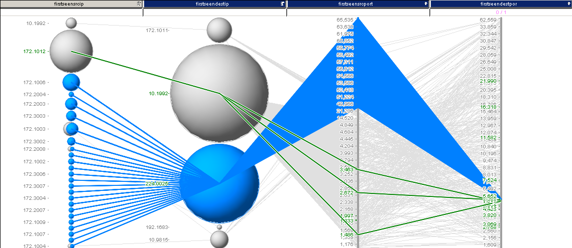
I selected some interesting traffic here. Turns out, we just found another destination port: 5535 for our list. I continued this analysis and ended up with something like 38 records, which are shown in the last image:
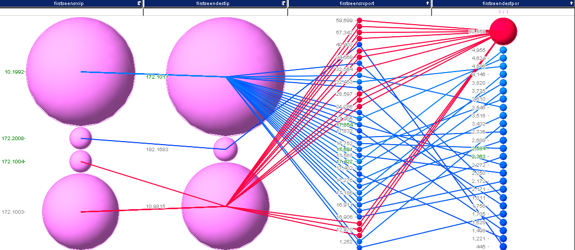
I’ll leave it at this for now. I think that’s a pretty good set of ports:
20,21,25,53,80,123,137,138,389,1900,1984,3389,5355
Oh well, if you want to fix your traffic now and turn around the wrong source/destination pairs, here is a hack in perl:
$ cat nf*.csv | perl -F\,\ -ane 'BEGIN {@ports=(20,21,25,53,80,123,137,138,389,1900,1984,3389,5355);
%hash = map { $_ => 1 } @ports; $c=0} if ($hash{$F[7]} && $F[8}>1024)
{$c++; printf"%s,%s,%s,%s,%s,%s,%s,%s,%s,%s,%s,%s,%s,%s,%s,%s,%s,%s,%s",
$F[0],$F[1],$F[2],$F[3],$F[4],$F[6],$F[5],$F[8],$F[7],$F[9],$F[10],$F[11],$F[13],$F[12],
$F[15],$F[14],$F[17],$F[16],$F[18]} else {print $_} END {print "count of revers $c\n";}'
We could have switched to visual analysis way earlier, which I did in my initial analysis, but for the blog I ended up going way further in SQL than I probably should have. The next blog post covers how to load all of the VAST data into a Hadoop / Impala setup.

Have you ever collected a packet capture and you needed to know what the collected traffic is about? Here is a quick tutorial on how to use AfterGlow to generate link graphs from your packet captures (PCAP).
I am sitting at the 2012 Honeynet Project Security Workshop. One of the trainers of a workshop tomorrow just approached me and asked me to help him visualize some PCAP files. I thought it might be useful for other people as well. So here is a quick tutorial.
Installation
To start with, make sure you have AfterGlow installed. This means you also need to install GraphViz on your machine!
First Visualization Attempt
The first attempt of visualizing tcpdump traffic is the following:
tcpdump -vttttnnelr file.pcap | parsers/tcpdump2csv.pl "sip dip" | perl graph/afterglow.pl -t | neato -Tgif -o test.gif
I am using the tcpdump2csv parser to deal with the source/destination confusion. The problem with this approach is that if your output format is slightly different to the regular expression used in the tcpdump2csv.pl script, the parsing will fail [In fact, this happened to us when we tried it here on someone else’s computer].
It is more elegant to use something like Argus to do this. They do a much better job at protocol parsing:
argus -r file.pcap -w - | ra -r - -nn -s saddr daddr -c, | perl graph/afterglow.pl -t | neato -Tgif -o test.gif
When you do this, make sure that you are using Argus 3.0 or newer. If you do not, ragator does not have the -c option!
From here you can go in all kinds of directions.
Using other data fields
argus -r file.pcap -w - | ra -r - -nn -s saddr daddr dport -c, | perl graph/afterglow.pl | neato -Tgif -o test.gif
Here I added the dport to the parameters. Also note that I had to remove the -t parameter from the afterglow command. This tells AfterGlow that there are not two, but three columns in the CSV file.
Or use this:
argus -r file.pcap -w - | ra -r - -nn -s daddr dport ttl -c, | perl graph/afterglow.pl | neato -Tgif -o test.gif
This uses the destination address, the destination port and the TTL to plot your graph. Pretty neat …
AfterGlow Properties
You can define your own property file to define the colors for the nodes, configure clustering, change the size of the nodes, etc.
argus -r file.pcap -w - | ra -r - -nn -s daddr dport ttl -c, | perl graph/afterglow.pl -c graph/color.properties | neato -Tgif -o test.gif
Here is an example config file that is not as straight forward as the default one that is included in the AfterGlow distribution:
color="white" if ($fields[2] =~ /foo/)

color="gray50"

size.target=$targetCount{$targetName};

size=0.5

maxnodesize=1
The config uses the number of times the target shows up as the size of the target node.
Comments / Examples / Questions?
Obviously comments and questions are more than welcome. Also make sure that you post your example graphs on secviz.org!



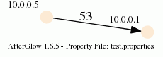
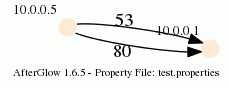
 There are cases where you need fairly sophisticated logic to visualize data. Network graphs are a great way to help a viewer understand relationships in data. In my last blog post, I explained how to
  Big data doesn’t help us to create security intelligence! Big data is like your relational database. It’s a technology that helps us manage data. We still need the analytical intelligence on top of the storage and processing tier to make sense of everything.