
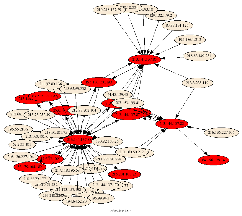
 I have been using link graphs a lot in my work of visualizing security data. They are a great methods to display relationships between entities. I guess the most used link graph is one that shows communications of machines. The nodes represent the communicating machines and arrows connecting them show flows.
You can use color and shape to encode more information, such as the amount o traffic transmitted or a machine’s role. I even extended the graphs to show three types of nodes: source nodes, event nodes, and target nodes.
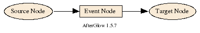
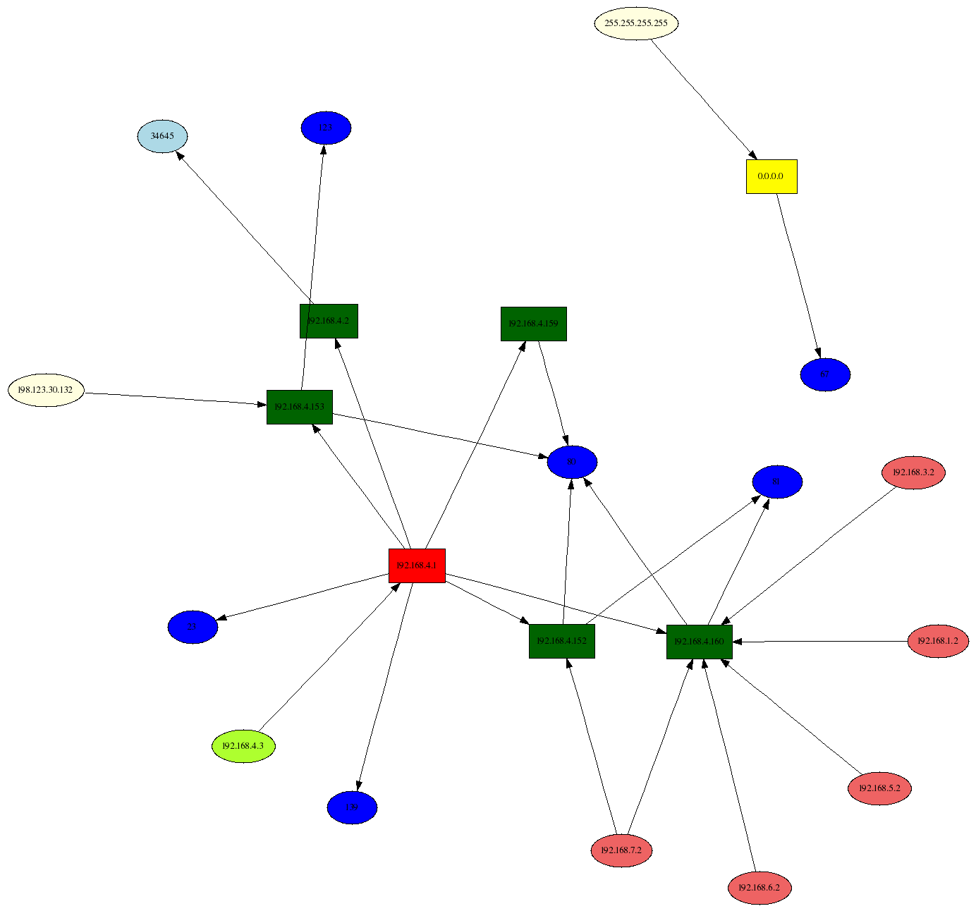
This lets me encode more information in a graph, such as the machines communicating and the service they used, as shown on the right.
All of this has been incredibly useful. However, for the longest time I have been thinking about how to include time into link graphs. To date, I don’t really have a good solution. Here are some things I have considered:
- Animation: This is the most obvious solution. You use a tool that replays the data. Use fast forward to speed up the animation. Ideally the tool would allow for forwarding and reversing the animation, just like the controls you have to watch a movie. This approach has the disadvantage of change blindness. There are changes that the human brain will not notice. And the probably even bigger problem are the layout algorithms that are generally not built for incremental updates. Adding new nodes to a graph moves the existing ones around and the viewer cannot locate them anymore. [I wrote about this in my book in Chapter 3.] You can counter the problem of instability by assigning each node a pre-computed location. Use some hashing algorithm to do so.
- Color: The idea would be to assign color to nodes or edges. Use some sort of encoding to show time. For example, the lighter a color, the late it happened. This approach is very limited. There are only so many colors you have available. The human eye can only differentiate, really differentiate about 8 hues. Any more and it gets really hard to tell which node is brighter. [It might be more than 8, but the number is really really low]
- Using arrows that order the connections: This was an idea I had a while back. I don’t think it’s actually useful, but here it is anyways: You generate a link graph and then you introduce a set of arrows that connect the edges. The arrows indicate time, so you connect the earliest event with the second earliest , and so on. This will really clutter the display an is probably really hard to read.
- Paralll coordinates: Add a coordinate for time. This can help in some instances. In others the time-axis will just be completely cluttered. But worth a try.
- Multiple, linked views: The idea here is to generate your link graph and then in addition, you also generate a display that encodes time. For example, a time table. On the x-axis you show time and on the y-axis you show, the source node’s field. The problem here is how do you link the two displays. Interactivity is almost a must. So that you could click on a node and see it in the time chart. Even better would be if you could encode the relationships in the time table. However, that might be hard.
- Using a time-base layout algorithm: I am too bad of a coder to actually implement this idea. I am also not sure what the result would be like. The idea would be to define the attraction between nodes as the time distance. There are many problems. What do you do if a connection shows up at multiple instances in time? I haven’t thought this true. But maybe there is a possibility here.
Unfortunately, all of these solutions have drawbacks. I think I favor timecharts for showing time-based activity. But then, the number of entities you can track is limited, etc.
Anyone have a solution for showing time-based activity? Even if it’s animation, what are some of the key things that would help making the animation easy to follow?
[tags]visualization, link graph, network graph, time visualization[/tags]
[…] Raffy – Security Data Visualization » Displaying Time in Link Graphs […]
Pingback by Raffy - Security Data Visualization » Displaying Time in Link Graphs | animesque.com — December 7, 2008 @ 6:06 pm
Would a parse tree with the parent node being the timestamp be usable I wonder…
Comment by Sp3ar0 — December 8, 2008 @ 5:54 am
Just to throw off some thoughts, deriving from what I learnt in Ettercap.
1. Line thickness = Log (t).
The thicker the line, the longer it has occurred.
2. Line colour. 8 hues for blocks of n hours to show last 8n hours. So if n=3 then last 24 hours.
I believe the above can be easily coded in without any change to top link graphs.
Cons: When there are > 20 sub-nodes linking to one node it will get messy. Otherwise if it is less than 10 it should be pretty discernible.
3. Line type. Tight and loose dashed lines to indicate how recent or how long event has passed. Faint line for events that occur more than 24 hours, eg. Again can be used with 8 or less colours to depict blocks of time it has passed.
Cons: When too many event sub-nodes occur more than 24 hours, line can be too faint to be discerned in a congested area.
Bottomline: Almost every implementation is bad if there are too many nodes/sub-nodes squeezed in a small area. 😛
Comment by Cappella — December 8, 2008 @ 4:53 pm
I used to do some work with RF Spectral analysis and we had a tool that displayed a 3D plot with Amplitude over Frequency and the 3rd dimension was the timestamp. You could replay, reverse, spread, narrow, turn, etc. It was good for a large dataset from say 0Hz up to 10Ghz and any strange occurances are cleary seen. Apply the same concept to port over ip and time. The depth of the view allows you to see back in time or as you replay that line comes into the front view…not sure if I explained that clearly enough, but I’ll try and code a demo to show what I mean.
Similar to this but replay/interaction with data is a must:
Sp3ar0
Comment by Sp3ar0 — December 9, 2008 @ 9:02 am
oops….
http://www-star.stanford.edu/projects/relay/images/rc1-2.gif
Comment by Sp3ar0 — December 9, 2008 @ 9:02 am
For animation approach, checkout Force-based Algorithms that address the issue you raised concerning the instability of incremental updates. I’d suggest you checkout Traer Physics particle system engine for processing.org visualization language and environment. If you are doing forensics on past data, then you can better position the addition of incremental updates because you’ll know what the future connectivity of that node will be. This will let you determine a better initial location that reduces the springiness of the animation. Maybe this is what you meant by “time-based layout”?
The temporal coloring approach could work for showing long-term changes but you’re right it isn’t good for discerning between individual changes due to human visual “just noticable difference”. Color could be used in an animation to highlight the new additions and then have the color fade away as time marches on.
As for adding time-dimension, there are at least two things you might try. Why confine yourself to 2d plot when you could visualize 3d plot with time as the z-component? But sticking with 2-d, choosing a single node as the center of gravity, you could have concentric circles to show the propagation of time and incremental node additions would appear within a time band. As you mention though, these only work well for smaller graphs as the edges will clutter the view (and look like a tangled spider web 🙂
A lot depends on the specific objective of what you’re trying to visualize and the insights you’re hoping to glean from such a visual.
Cheers.
Comment by Dustin Burke — December 9, 2008 @ 9:36 am
A simple variation of what Cappella posted above makes sense to me. Using a simple grayscale model with 16-32 levels would likely be usable without cluttering the graph. The question is how to assign the colors…there seem to be several reasonable approaches that are likely to have widely different levels of implementation complexity.
1 – A simple linear scale, with time broken into n intervals and links colored based upon the interval in which they were started. Black is most recent (freshest) and lighten over time.
2 – A logarithmic scale, like the above, with greater resolution for recent events.
1/2a – A variation of either of the above where duration of the link is encoded by a gradient in the line…the originating side encoded with the start time, and the destination side encoded with the end time (up to and including black for current).
3 – A ‘node relative’ scale, with each node having links colored based upon the sequence/time that the link was established with the node relative to other links to the node. Would be screwy to look at, but might provide good sequencing information when looking at things like outbreaks. Gradients may be required here as well to properly encode the sequence.
This approach could be used for the node itself as well by coloring the border to indicate when it was introduced to the graph.
Great stuff.
Comment by Bob — February 4, 2009 @ 5:58 pm
Here’s a quick example using a single color showing initialization time.
http://img11.imageshack.us/img11/2064/testxn3.gif
And another showing start/end time.
http://img18.imageshack.us/img18/7630/testrg4.gif
Not perfect, but not bad either…16-20 is probably the max usable gradients.
Comment by Bob — February 4, 2009 @ 7:00 pm