PixlCloud is my latest employer. I founded the company two weeks ago. It is going to be a company that offers a service in the cloud. The mission of the company is to build a data visualization SaaS. Users can submit their data to the service and then interactively visualize it. One of the cornerstones of the service is that anyone should be able to use it. You won’t have to be a visualization expert or an expert in data mining or alike.
I am gathering user input. If you feel like you have a need for such a data visualization service or you would like to offer your input for any aspect of my company, be that the market, the product, the users, marketing, product features, or really anything, drop me a line.
Have you seen the book Applied Security Visualization on the shelf at your local book store? If so, send me a picture and I will post it…
My friend Jan spotted the book on November 28th at the Eason Bookshop on O’Connell St in Dublin:

 Richard Bejtlich rated Applied Security Visualization as the second best security book in 2008! Read more about the books Richard read at: Best Book Bejtlich Read in 2008. Thanks Richard!
[tags]applied security visualization, security, visualization, security books, books[/tags]
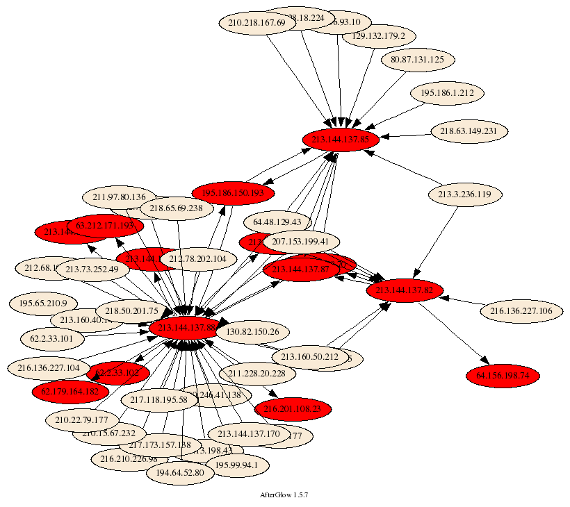
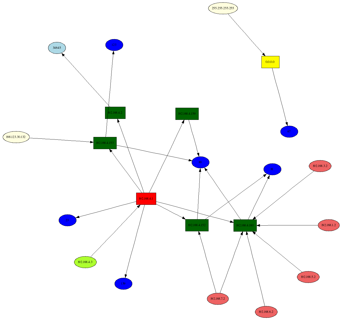
 I have been using link graphs a lot in my work of visualizing security data. They are a great methods to display relationships between entities. I guess the most used link graph is one that shows communications of machines. The nodes represent the communicating machines and arrows connecting them show flows.
You can use color and shape to encode more information, such as the amount o traffic transmitted or a machine’s role. I even extended the graphs to show three types of nodes: source nodes, event nodes, and target nodes.
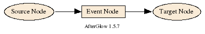
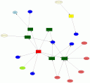
This lets me encode more information in a graph, such as the machines communicating and the service they used, as shown on the right.
All of this has been incredibly useful. However, for the longest time I have been thinking about how to include time into link graphs. To date, I don’t really have a good solution. Here are some things I have considered:
- Animation: This is the most obvious solution. You use a tool that replays the data. Use fast forward to speed up the animation. Ideally the tool would allow for forwarding and reversing the animation, just like the controls you have to watch a movie. This approach has the disadvantage of change blindness. There are changes that the human brain will not notice. And the probably even bigger problem are the layout algorithms that are generally not built for incremental updates. Adding new nodes to a graph moves the existing ones around and the viewer cannot locate them anymore. [I wrote about this in my book in Chapter 3.] You can counter the problem of instability by assigning each node a pre-computed location. Use some hashing algorithm to do so.
- Color: The idea would be to assign color to nodes or edges. Use some sort of encoding to show time. For example, the lighter a color, the late it happened. This approach is very limited. There are only so many colors you have available. The human eye can only differentiate, really differentiate about 8 hues. Any more and it gets really hard to tell which node is brighter. [It might be more than 8, but the number is really really low]
- Using arrows that order the connections: This was an idea I had a while back. I don’t think it’s actually useful, but here it is anyways: You generate a link graph and then you introduce a set of arrows that connect the edges. The arrows indicate time, so you connect the earliest event with the second earliest , and so on. This will really clutter the display an is probably really hard to read.
- Paralll coordinates: Add a coordinate for time. This can help in some instances. In others the time-axis will just be completely cluttered. But worth a try.
- Multiple, linked views: The idea here is to generate your link graph and then in addition, you also generate a display that encodes time. For example, a time table. On the x-axis you show time and on the y-axis you show, the source node’s field. The problem here is how do you link the two displays. Interactivity is almost a must. So that you could click on a node and see it in the time chart. Even better would be if you could encode the relationships in the time table. However, that might be hard.
- Using a time-base layout algorithm: I am too bad of a coder to actually implement this idea. I am also not sure what the result would be like. The idea would be to define the attraction between nodes as the time distance. There are many problems. What do you do if a connection shows up at multiple instances in time? I haven’t thought this true. But maybe there is a possibility here.
Unfortunately, all of these solutions have drawbacks. I think I favor timecharts for showing time-based activity. But then, the number of entities you can track is limited, etc.
Anyone have a solution for showing time-based activity? Even if it’s animation, what are some of the key things that would help making the animation easy to follow?
[tags]visualization, link graph, network graph, time visualization[/tags]
 I am presenting at the FIRST 2008 conference in Vancouver next week. I am speaking on my birthday, June 25th, from 9.50 until 12.50. The topic is “Applied Security Visualization” – the same as my book title. I am going through some of the material from the book and show how visualization can be used to analyze log files.
Some of the highlights:
- I am going to show how you can use Splunk to manage not just single-line logs, but also analyze multi-line data, such as data from top, ps, etc.
- I am showing how you can use AfterGlow with Splunk.
- I am probably going to show a sneak peak of DAVIX. The Data Visualization and Analysis Linux (DAVIX) is a live CD that will be released at BlackHat this year.

OnSecrity just released another video of the conversation we recorded last year during RSA. I am talking about security visualization in light of the book I am working on. This video cast is the sequel to the first one that I posted a few days ago.
 One of the topics I am discussing in the video is the “false dichotomy” between security and visualization. This is a topic that I talked about during a talk at the MIT Lincoln Labs at the beginning of December. The presentation showed how there are really two disciplines that come together in security visualization: Security and Visualization. The problem with this is that visualization people don’t know much about security and the other way around. It’s a very interesting topic to explore and it explains some of the mistakes that are being made with visualization tools and is also reflected in visualization research.
[tags]visualization, security, videocast[/tags]