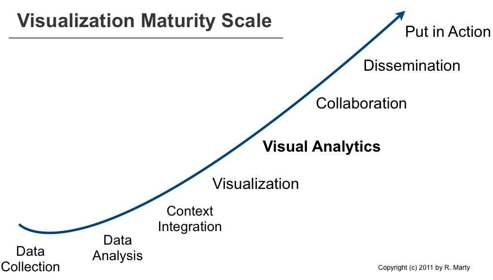
The visualization maturity scale can be used to explain a number of issues in the visual analytics space. For example, why aren’t companies leveraging visualization to analyze their data? What are the requirements to implement visual analytics services? Or why don’t we have more visual analytics products?
About three years ago I posted the log management maturity scale. The maturity scale helped explain why companies and products are not as advanced as they should be in the log management, log analysis, and security information management space.
While preparing my presentation for the cyber security grand challenge meeting in early December, I developed the maturity scale for information visualization that you can see above.
Companies that are implementing visualization processes move from through each of the steps from left to right. So do product companies that build visualization applications. In order to build products on the right-hand side, they need to support the pieces to the left. Let’s have a look at the different stages in more detail:
- Data Collection: No data, no visuals (see also Where Data Analytics and Security Collide). This is the foundation. Data needs to be available and accessible. Generally it is centralized in a big data store (it used to be relational databases and that’s a viable solution as well). This step generally involves parsing data. Turning unstructured data or semi-structured data into structured data. Although a fairly old problem, this is still a huge issue. I wonder if anyone is going to come up with a novel solution in this space anytime soon! The traditional regular expression based approach just doesn’t scale.
- Data Analysis: Once data is centralized or accessible via a federated data store, you have to do something with it. A lot of companies are using Excel to do the first iteration of data analysis. Some are using R, SAS, or other statistics and data analytics software. One of the core problems here is data cleansing. Another huge problem is understanding the data itself. Not every data set is as self explanatory as sales data.
- Context Integration: Often we collect data, analyze it, and then realize that the data doesn’t really contain enough information to understand it. For example in network security. What does the machine behind a specific IP address do? Is it a Web server? This is where we start adding more context: roles of machines, roles of users, etc. This can significantly increase the value of data analytics.
- Visualization: Lets be clear about what I refer to as visualization. I am using visualization to mean reporting and dashboards. Reports are static summaries of historical data. They help communicate information. Dashboards are used to communicate information in real-time (or near real-time) to create situational awareness.
- Visual Analytics: This is where things are getting interesting. Interactive interfaces are used as a means to understand and reason about the data. Often linked views, brushing, and dynamic queries are key technologies used to give the user the most freedom to look at and analyze the data.
- Collaboration: It is one thing to have one analyst look at data and apply his/her own knowledge to understand the data. It’s another thing to have people collaborate on data and use their joint ‘wisdom’.
- Dissemination: Once an analysis is done, the job of the analyst is not. The newly found insights have to be shared and communicated to other groups or people in order for them to take action based on the findings.
- Put in Action: This could be regarded as part of the dissemination step. This step is about operationalizing the information. In the case of security information management, this is where the knowledge is encoded in correlation rules to catch future instances of the same or similar incidents.
For an end user, the visualization maturity scale outlines the individual steps he/she has to go through in order to achieve analytical maturity. In order to implement the ‘put in action’ step, users need to implement all of the steps on the left of the scale.
For visualization product companies, the scale means that in order to have a product that lets a user put findings into action, they have to support all the left-hand stages: there needs to be a data collection piece; a data storage. The data needs to be pre-analyzed. Operations like data cleansing, aggregation, filtering, or even the calculation of certain statistical properties fall into this step. Context is not always necessary, but often adds to the usefulness of the data. Etc. etc.
There are a number of products, both open source, as well as commercial solutions that are solving a lot of the left hand side problems. Technologies like column-based data bases (e.g., MongoDB) or map reduce (e.g., Hadoop), or search engines like ElasticSearch are great open source examples of such technologies. In the commercial space you will find companies like Karmaspehre or DataMeer tackling these problems.
Comments? Chime in!

