October 4, 2007
 During the FIRST conference in Seville earlier this year, I was talking to Ben Chai at about 12.30am. We were sitting in the bar area when he suddenly took out his microphone and started interviewing me. The talk is pretty funny. The podcast shows that I don’t have a very good sense of humor 😉 Oh, and by the way, reading tea leaves is probably going to be the topic of one of my next talks!
I don’t think this was my best night, when Ben record this. I spend about 1.5 hours trying to pick a TSA lock with a paper clip. Okay, Adam couldn’t do it anymore either, but still. In the meantime, I learned how it is done for real – the lock picking 😉
Listen to the podcast here.
September 24, 2007

I spent the first week of September in Kuala Lumpur, Malaysia, where I was speaking about insider crime visualization at Hack In The Box. The conference is held annually and I was surprised about how big it was. A lot of attendees from the area, but also from other parts of the world, for example from Germany. In general I was fairly impressed with the caliber of people that presented.

What I enjoyed a lot as well, was the lock-picking village … The guys running it were real experts on the topic and had excellent tools to teach you the art of lock picking.
For those interested, I have the presentation available here. The download is fairly big. Sorry about that. The conference also made the rest of the presentations available.
On to the next conference. See you in Jakarta end of October.
September 16, 2007
As you might have seen on secviz.org, AfterGlow 1.5.9 is out. The announcement of AfterGlow 1.5.9 on secviz has some more details on what’s new. Just quickly here: The URL feature is pretty interesting and addresses some old thoughts and things I have been talking about with other people (Peter, are you reading this?). The issue there was that the AfterGlow graphs are very static and that’s kind of a bummer. It would be really nice if there was more interactivity. Clicking on nodes for example. Well, this is now a first step towards that. Along with the Splunk – AfterGlow integration, this is actually going almost all the way of completing the interaction round trip. I know, in terms of real interactivity, there is still a lot missing, but I think this is taking care of some really interesting use-cases.
[tags]afterglow, visualization, splunk, interactivity, graphviz[/tags]
June 18, 2007
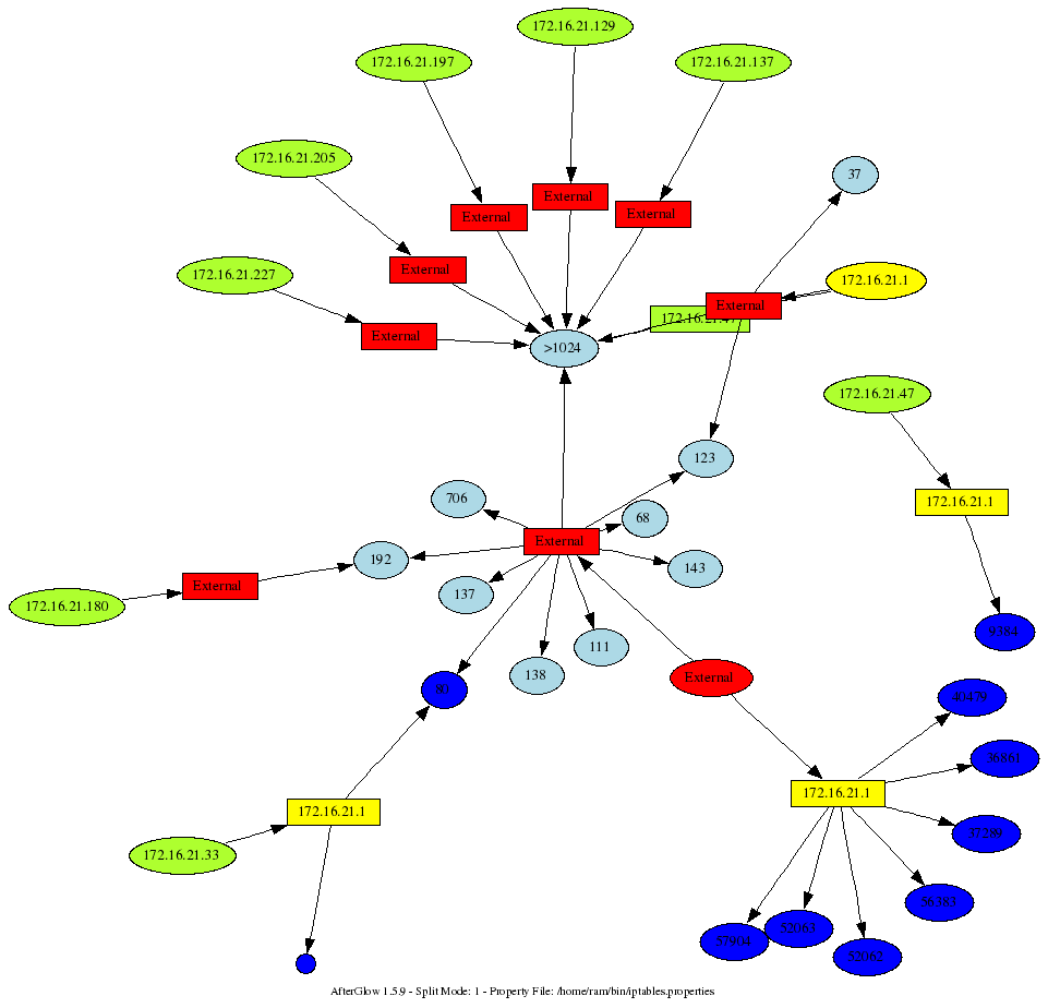
I am sitting in Seville, at the First conference, where I will be teaching a workshop on Wednesday. The topic is going to be insider threat visualization. While sitting in some of the sessions here, I was playing with my iptables logs. Here is a command I am running to generate a graph from my iptables logs:
cat /var/log/messages | grep "BLOCK" | perl -pe 's/.*\] (.*) (IN=[^ ]*).*(OUT=[^ ]*).*SRC=([^ ]* ).*DST=([^ ]* ).*PROTO=([^ ]* ).*?(SPT=[^ ]+ )?.*?(DPT=\d* )?.*?(UID=\d+)?.*?/\1,\2,\3,\4,\5,\6,\7,\8,\9/' | awk -F, '{printf "%s,%s,%s\n",$4,$5,$8}' | sed -e 's/DPT=//' -e 's/ //g' | afterglow.pl -e 1.3 -c iptables.properties -p 1 | neato -Tgif -o/tmp/test.gif; xloadimage /tmp/test.gif
This is fairly ugly. I am not going to clean it up. You get the idea. Now, what does the iptables.properties look? Well, if you thought the command above was ugly. The properties file is completely insane, but it shows you the power of using the “variable” assignment:
 variable=$ip=`ifconfig eth1 | grep inet`

variable=$ip=~s/.*?:(\d+\.\d+\.\d+\.\d+).*\n?/\1/;

variable=$subnet=$ip; $subnet=~s/(.*)\.\d+/\1/;

variable=$bcast=$subnet.".255";
color="invisible" if (field() eq "$bcast")

color="invisible" if ($fields[2] eq "67")

color="yellow" if (field() eq "$ip")

color.source="greenyellow" if ($fields[0]=~/^192\.168\..*/);

color.source="greenyellow" if ($fields[0]=~/^10\..*/);

color.source="greenyellow" if ($fields[0]=~/^172\.16\..*/);

color.source="red"

color.event="greenyellow" if ($fields[1]=~/^192\.168\..*/)

color.event="greenyellow" if ($fields[1]=~/^10\..*/)

color.event="greenyellow" if ($fields[1]=~/^172\.16\..*/)

color.event="red"

cluster.target=">1024" if (($fields[2]>1024) && ($fields[1] ne "$ip"))

cluster.source="External" if (field()!~/^$subnet/)

cluster.event="External" if (field()!~/^$subnet/)

color.target="blue" if ($fields[1] eq "$ip")

color.target="lightblue"
Mind you, this was run on an Ubuntu Linux. You might have to change some of the commands and parsing of the output. Pretty neat, ey? Here is a sample output that this generated. My box is yellow. The question that I was trying to answer: Why is someone trying to conect to me on port 80?
[tags]visualization, iptables, afterglow, security[/tags]
June 17, 2007
Finally! I worked on this AfterGlow release forever. I submitted a few checkpoints to CVS before I felt read to released AfterGlow 1.5.8. I highly recommend upgrading to 1.5.8. It has a few bugfixes, but what you will find most rewarding is the new color assignment heuristic and the capability to change the node sizes. Here is the complete changelog:
06/10/07        Version 1.5.8

- Nodes can have a size now:

(size.[source|target|event]=<expression returning size>)

Size is accumulative! So if a node shows up multiple times, the

values are summed up!! This is unlike any other property in

AfterGlow where values are replaced.

- The maximum node size can be defined as well, either with a property:

(maxnodesize=<value>)

or via the command line:

-m=<value>

The size is scaled to a max of 'maxsize'. Note that if you

are only setting the maxsize and no special sizes for nodes

Afterglow will blow the nodes up to optimal size so the labels

will fit.

There is a limit also, if you want the source nodes to be a max of say

1, you cannot have the target nodes be scaled to fit the labels. They

will have a max size of 1 and if you don't use any expression, they will

be of size 1. This can be a bit annoying ;)

Be cautious with sizes. The number you provide in the assignment is not the actual size

that the node will get, but this number will get scaled!

- One of the problems with assignments is that they might get overwritten with later nodes

For example, you have these entries:

A,B

A,C

and your properties are:

color="blue" if ($fileds[1] eq "B")

color="red"

you would really expect the color for A to be blue as you specified that explicitly.

However, as the other entry comes later, the color will end up being red. AfterGlow takes

care of this. It will determine that the second color assignment is a catch-all, identified

by the fact that there is no "if" statement. If this happens, it will re-use the more specific

condition specified earlier. I hope I am making sense and the code really does what you would

expect ;)

- Define whether AfterGlow should sum node sizes or not.

(sum.[source|target|event]=[0|1];)

by default summarization is enabled.

- Added capability to define thresholds per node type in properties file

(threshold.[source|event|target]=<value>;)

- Added capability to change the node shape:

shape.[source|event|target]=

(box|polygon|circle|ellipse|invtriangle|octagon|pentagon|diamond|point|triangle|plaintext)

- Fixed an issue where, if you use -t to only process two columns

and you can use the third in the property file for size or color.

The third column was not carried through, however. This is fixed!

- The color assignment heuristic changed a bit. Along the same lines that the size assignment works.

Catch-alls are not taking presedence anymore. You might want to take this into account when defining

colors. The catch-all will only be used, if there was never a more specific color assignment that

was evaluated for this node. For example:

color="gray50" if ($fields[2] !~ /(CON|FIN|CLO)/)

color="white"

This is used with a three-column dataset, but only two are displayed (-t). If the first condition

ever evaluated to true for a node, the last one will not hit, although the data might have a node that

evaluates to false in the first assignment and then the latter one would grip. As a catch-all it does

get superior treatment. This is really what you would intuitively assume.

- Just another note on color. Watch out, if you are definig colors not based on the fields in the

data, but some other conditions that might change per record, you will get the wrong results as

AfterGlow uses a cache for colorswhich keys off the concatenation of all the field values. Just

a note! Anyone having problems with this? I might have to change the heuristic for caching then. Let

me know.
[tags]afterglow, visualization, security log analysis, security visualization[/tags]
May 28, 2007
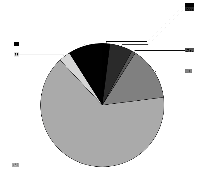
My R journey seems to be over… It’s just too complicated to get charts and plots right with R. I found a new library that I staerted playing with: chart director. I am using Perl to drive the graph generation and it’s actually fairly easy to use. There are some cumbersome pieces, such as seg-faults when you have NULL values in a matrix that you are drawing, but that’s things I can deal with ;
Here is a sample graph I generated: (I know, the color selection is fairly horrible!)
[tags]R, charts, visualization, perl[/tags]
May 27, 2007
I just finished reading the Information Dashboard Design book by Stephen Few. I love it. I am definitely going to use some of the concepts that I learned about for my own book. I especially like how Stephen illustrates Tufte’s principle of reducing the non-data ink in charts. Definitely a book people who are building dashboards should read!
[tags]dashboard,visualization,design,tufte[/tags]
May 24, 2007
I am teaching a workshop at FIRST in Seville in June about Visualizing Insider Threat Data. I recorded a PodCast introducing my workshop and talking about visualization in general.
[tags]visualization, visualization podcast, security[/tags]
May 15, 2007
I was just listening to this podcast about security information management (SIM) systems. Tom Bowers from Information Security magazine is talking about various topics in SIM. Unfortunately I have to disagree with Tom on a couple of points, if not more. But let me pick the couple I find most important:
- Visualization is a great tool to see attacks in real-time. However, you can only see where the attacks are coming from and not how many. What? Why would I not be able to visualize that? You can map that to edge size, node size, map it as a color to you nodes, etc. I don’t know what system he looked at to make this statement, but that’s wrong!
- Active Response is something that SIMs cannot do. Well. Wrong again. I could tell you how ArcSight is doing this with the Threat Response Manager (TRM), but that would be a vendor pitch. That’s why I am going to mention SEC, the simple correlation engine. It can execute an arbitrary action. Well, it’s not quantum leaps from there to imagine how you could issue a command to add an ACL to a router for example. To sum up: Active response is something SIMs can do! If you want to know how exactly you do this with SEC, read my chapter on event analysis in the new Snort book.
These were the main points where I disagree with Tom. He could have done a bit of a better job describing the benefits of visualization, but that’s another story.
[tags]arcsight,visualization[/tags]
March 13, 2007
I came accross this really nice library of R graphs and scripts. One that I really liked is a scatter plot with histograms for each of the axes. The code to generate such a graph is the following:
Dataset < - read.table("/home/ram/foo2_200.csv", header=FALSE, sep=",")
x <- as.numeric(Dataset$V2)
y <- as.numeric(Dataset$V3)
nf <- layout(matrix(c(2,0,1,3),2,2,byrow=TRUE), c(3,1), c(1,3), TRUE)
par(mar=c(3,3,1,1))
plot(x,y,xlab="",ylab="")
par(mar=c(0,3,1,1))
xhist <- hist(x, breaks=seq(min(x),max(x),(max(x)-min(x))/24), plot=FALSE)
barplot(xhist$count,axes=FALSE,space=0,col=heat.colors(24))
par(mar=c(3,0,1,1))
yhist <- hist(y, breaks=seq(min(y),max(y),(max(y)-min(y))/24), plot=FALSE)
barplot(yhist$count,axes=FALSE,space=0,horiz=TRUE,col=heat.colors(24))
And the result looks like this:


 During the FIRST conference in Seville earlier this year, I was talking to Ben Chai at about 12.30am. We were sitting in the bar area when he suddenly took out his microphone and started interviewing me. The talk is pretty funny. The podcast shows that I don’t have a very good sense of humor 😉 Oh, and by the way, reading tea leaves is probably going to be the topic of one of my next talks!